

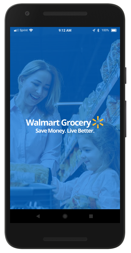
Walmart Grocery - Mobile App
Challenge: Discover pain points of current website and propose solutions to improve user experience in a mobile app.
Deliverables: Strategy, User research report, competitative anaylsis, affinity map, personas, user journey map, Lo-Fi sketches, UI, and Hi-Fi prototype.
Role: Product Designer

Goals and Objectives
Develop a complimentary mobile experience for Walmart Grocery to help customers easily access grocery products and schedule pick up.
Challenge
- The challenge is to understand current Walmart users' response to the website, discover pain points, and propose a mobile solution to improve user experience.
Process
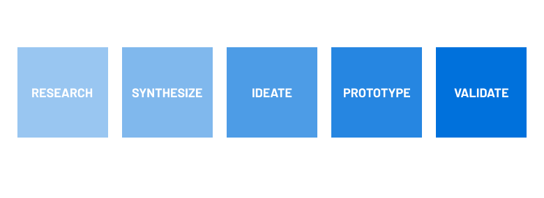
Starting from the initial user research phase, I conducted user interviews and a moderated usability study of the current website to understand the problems users face. I also conducted a competitive analysis to ensure the new app will be up-to-date with current trends. During the synthesis phase, I gathered all of the data and created an affinity map to determine priority pain points. Then I created two personas to ensure empathy during the entire design process. I also created a user journey map to understand where users are having trouble, created Lo-Fi sketches and a Hi-Fi prototype in Figma. By the end, I was able to validate that the user pain points had been solved by the designs. The project timeline was 4 weeks.
RESEARCH
Preliminary Research
Since Walmart does not have a dedicated app for their grocery services, I conducted a competitive analysis of direct and in-direct competitors to ensure the new app will be up-to-date on current trends and provide unique opportunities.

DIRECT COMPETITOR
STRENGTHS
Attention grabbing icons
Upfront coupons
Meal planning tool
Category navigation is clean
WEAKNESSES
Missing images
Deceptive links
Hard to get started
Hard to discover new items
Difficulty checking out
Substitutions limited

DIRECT COMPETITOR
STRENGTHS
Reserve time slot
Lots of categories
Upfront pricing
WEAKNESSES
Color contrast is hard to read
Separate apps for coupons and shopping
Long loading times
Confusing items list
No way to search generically
Sign in twice to check out

INDIRECT COMPETITOR
STRENGTHS
Lots filtering options
Dietary options
Easy to navigate
List of food options
Edit meals
Easy to check out
WEAKNESSES
Check out button blinds into background
Not intuitive
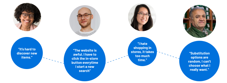
User Research
Using this article about the key demographic for Walmart. I selected four frequent Walmart shoppers between the ages of 25-34 and 45-54, two males and two females. Each was interviewed about their thoughts on the current Walmart website, then participated in a usability study using the current site.
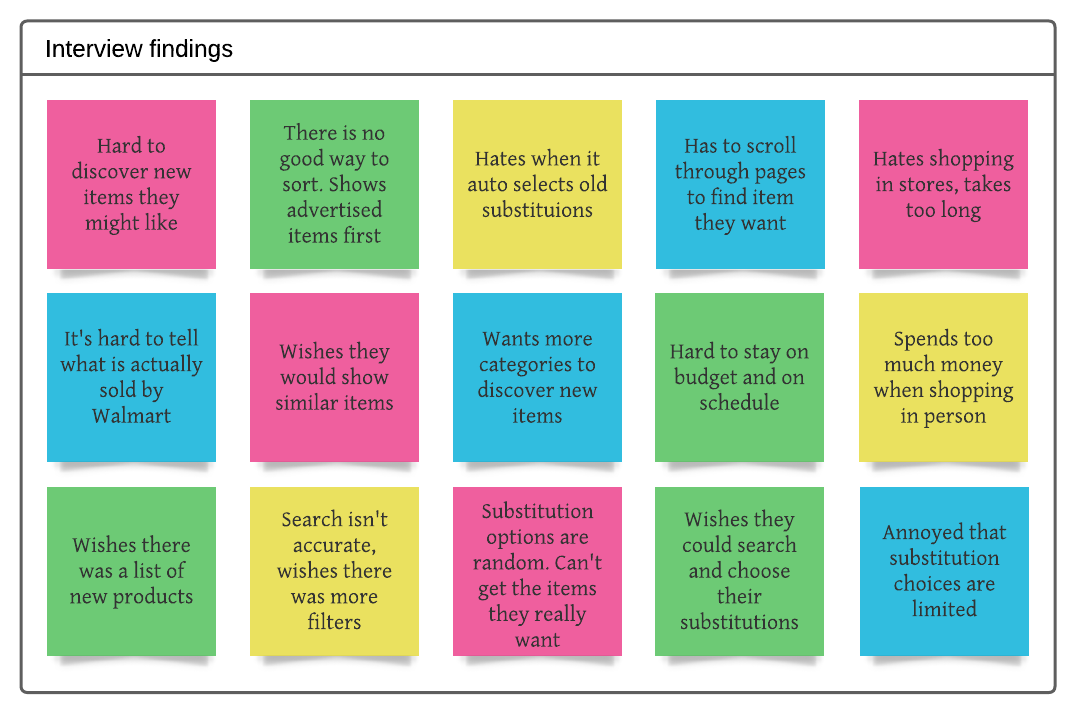
Key Findings
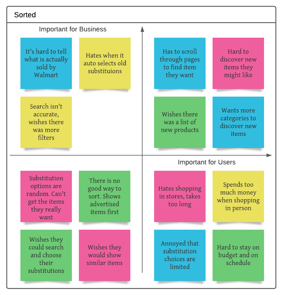
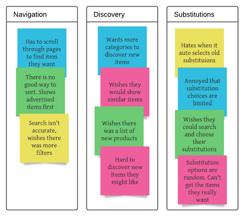
I created an affinity map to sort out the data gathered from the usability study and user interviews to better determine the priority pain points.
Personas
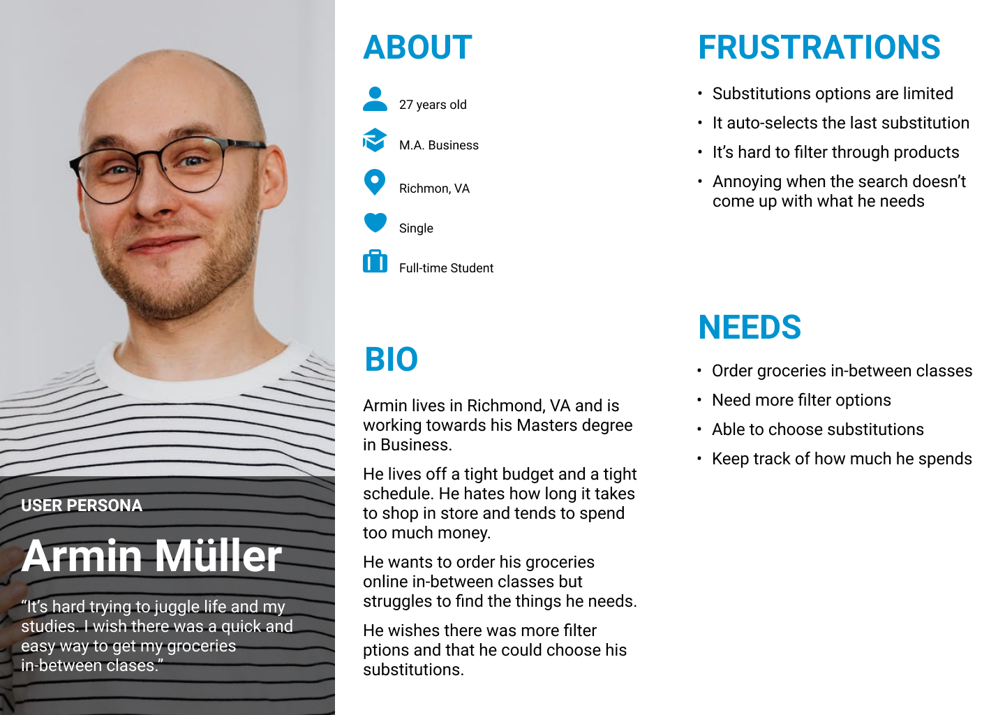
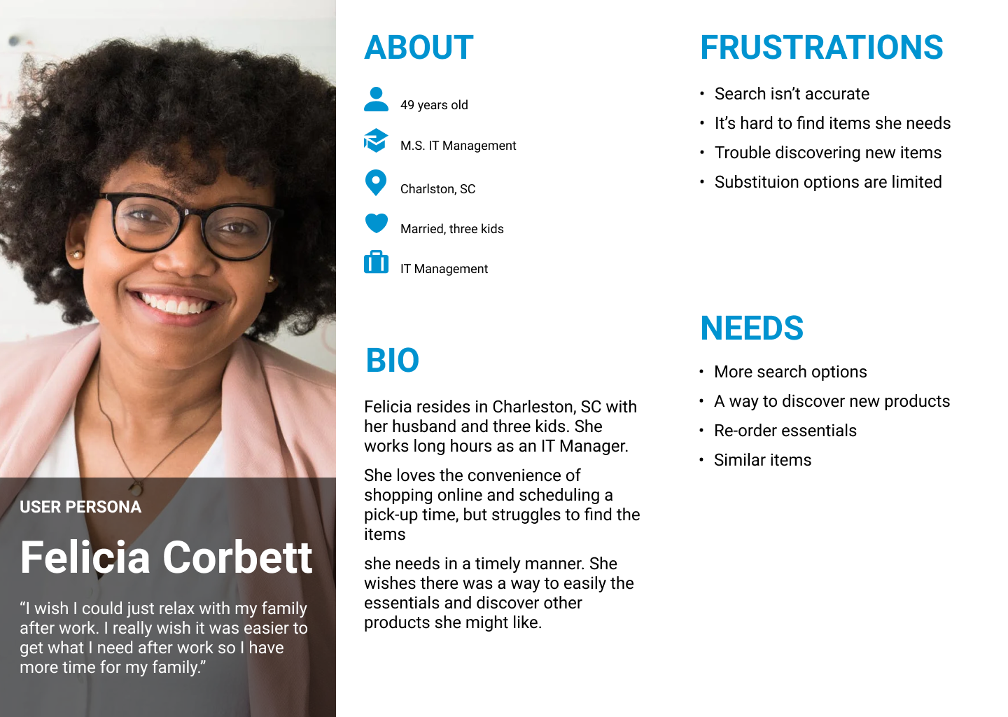
After the data was processed, I created two user personas based on research to communicate the struggles the key demographic face for the duration of the design.
IDEATION
User Journey Map
I created a user journey map to ensure an intuitive user experience. This allowed me to pinpoint any additional problems or opportunities before starting the design phase.
ACTION
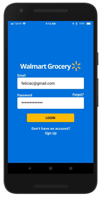
1. Open Walmart app and sign in
TASK LIST
- Open the Walmart Grocery app
- Create a new account
- Login
FEELINGS
- Excited
- Anxious
IMPROVEMENT OPPORTUNITIES
- Intuitive account form
- Option to view as a guest
ACTION
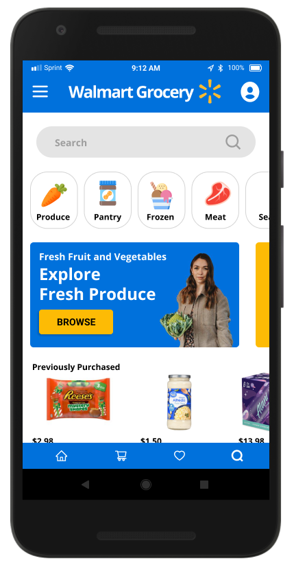
2. Browse products
TASK LIST
- Select category
- Scroll through items
- Click on a product
FEELINGS
- Interested in options
- Overwhelmed
IMPROVEMENT OPPORTUNITIES
- Search box to find exactly what you need
- Prompts to explore popular items/new items
ACTION
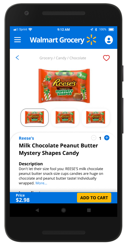
3. Add to cart
TASK LIST
- Decide on product
- Read over details/price
- Add to cart
FEELINGS
- Determined
- Relieved
- Excited
IMPROVEMENT OPPORTUNITIES
- Quick and easy to read info
- Attention grabbing add to cart button
- Product suggestions/similar
ACTION
4. Check out
TASK LIST
- Click on cart icon
- Review cart
- Click check out
FEELINGS
- Confused where to find cart
- Annoyed by scrolling
IMPROVEMENT OPPORTUNITIES
- Check out button floats
- Total price front and center in cart
- Pop-up 'check-out?' prompt
ACTION
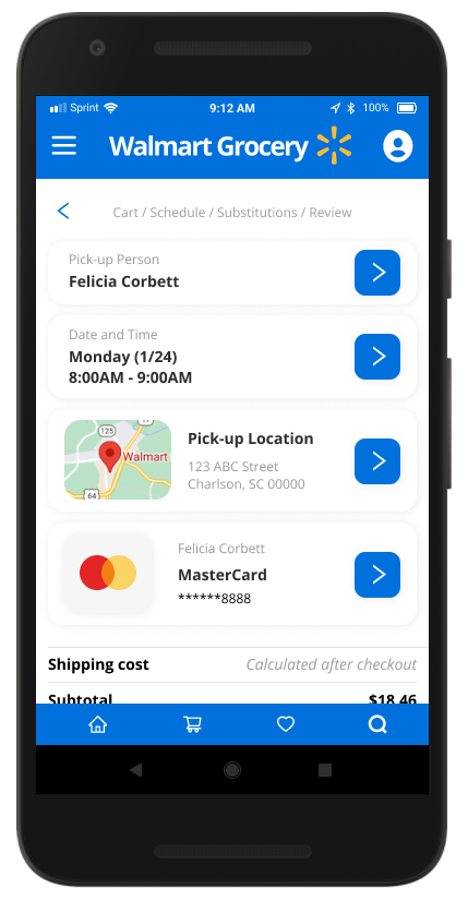
5. Schedule pick-up
TASK LIST
- Add in check out details
- Select pick up location
- Select date and time
- Confirm check out
FEELINGS
- Annoyed about entering details
- Confused by selecting store
- Anxious about forgetting time
IMPROVEMENT OPPORTUNITIES
- Remember checkout details
- Add favorite stores
- Maps of available locations
- Email/text reminders
- Email confirming time/date
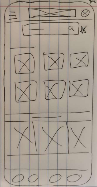
Lo-Fi Sketches
Based on the established user pain points, I sketched multiple options for each screen. During the process of the design, I continuously referred to the target audience and research data to ensure the designs were focused on improving the user experience.
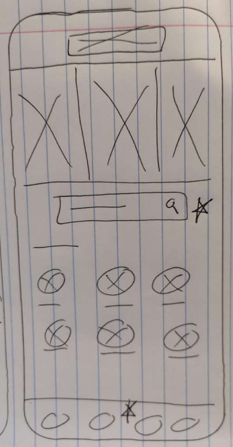
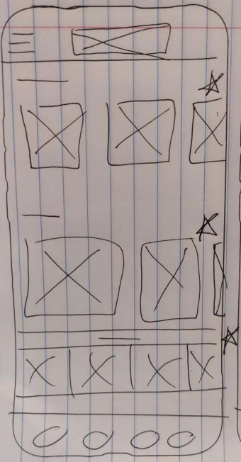
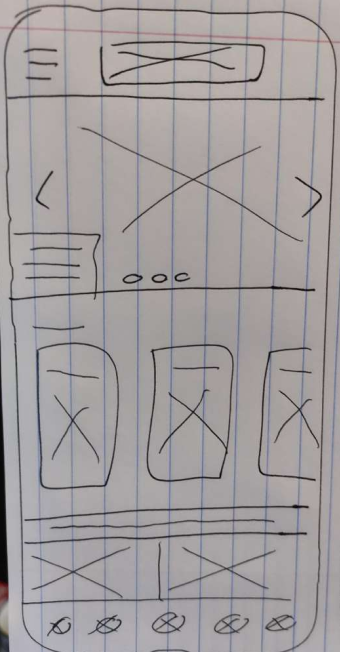
Based on my research insights, I prioritized three main objectives:
- Provide a platform where users can easily search for the items they need using a variety of filter, sort, and search options.
- Provide a platform where users can discover new items, categories, and see related products.
- Provide a platform where users can search for and choose the substitutions they want.
PROTOTYPE
Hi-Fi Prototype
Moving forward, I turned my Lo-Fi sketches into a Hi-Fi prototype.
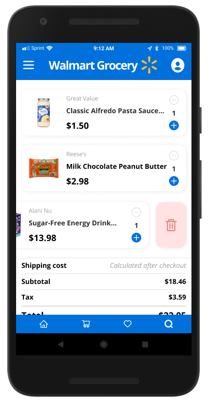
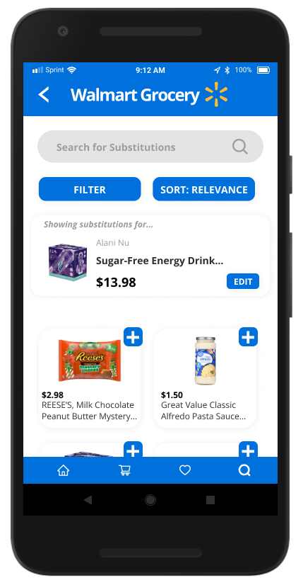
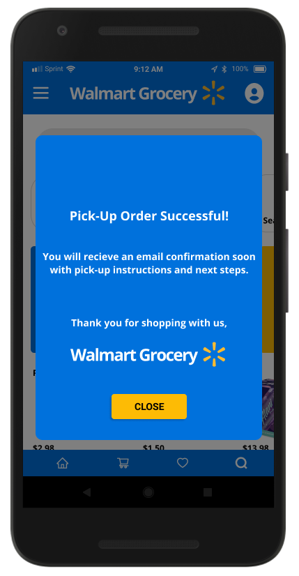
Clickable Prototype
The clickable prototype was created to test and validate the design. It was very useful in understanding how real users navigate the app and I gained realistic insights on what worked well and what required further improvement. The prototype only includes the main user flow and aspects that I planned to test users on.
VALIDATE
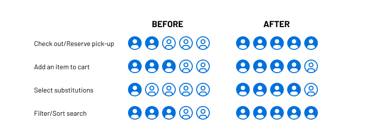
Conclusion
After four weeks of user research, analyzing, and designing, I was able to create a Hi-Fi prototype and validate the assumptions and changes I made. Using the clickable prototype with four participates, I received the following data:
Below is the results from our Hi-Fi usability study:
- (60% increase) 5 out of 5 users were able to successfully check out and reserve pick-up.
- (20% increase) 4 out of 5 users were able to successfully add an item to the cart.
- (60% increase) 4 out of 5 users were able to virtually select substitutions
- (40% increase) 5 out of 5 users intuitively knew how to sort and filter the search.
After Thoughts
This UX case study was an amazing learning experience. At the beginning of this project, I was fascinated to learn how other users interacted with the Walmart website when shopping for groceries. It was very insightful to see how differently each user used it. This gave me valuable insight into the issues users face.
This project really showed me how important research is and how each piece of data is a valuable part to the puzzle.
Note: I do not work for, nor am I affiliated with Walmart. This UX study was done as a learning experience to explore the products I use and how to improve them.