

Seneca Light & Water - Website Redesign
Challenge: Redesign the Seneca Light & Water website into a responsive design that offers users an intuitive navigation experience.
Deliverables: Strategy, User research report, affinity map, personas, information architecture, Lo-Fi sketches, UI, Usability Study, and Hi-Fi prototype.
Role: Product Designer
Goals and Objectives
Redesign the Seneca Light & Water website into a responsive design that has intuitive navigation, readability, a strong brand identity, and a clear call to action.
Challenge
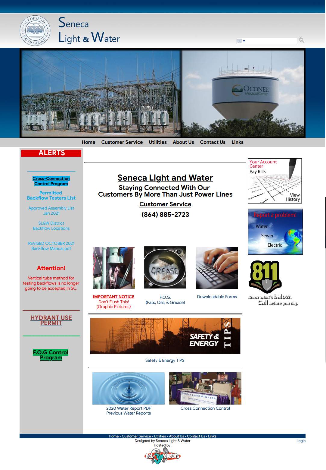
- The Seneca Light & Water's current website has a cluttered layout, poor readability, hard to find buttons, an unclear brand, and causes the user to become frustrated.
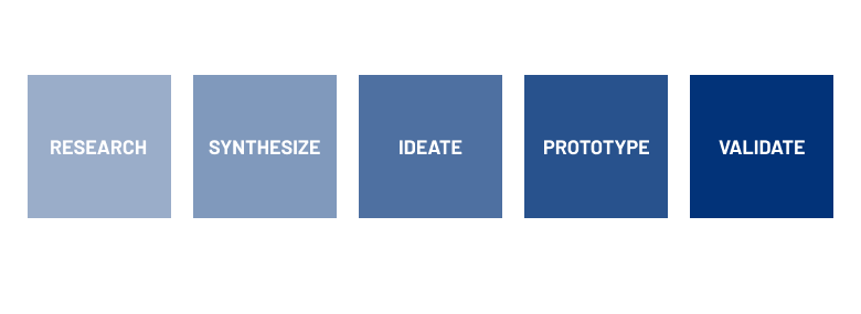
Process
Starting from the user research phase, I first evaluated the current website to determine what I was working with, this helped me find out what kinds of questions I would need to ask users to gather additional insight. Since there was no business or demographic information for the company, I turned to the most recent census reports for the city of Seneca, SC to find my key demographics. Using this information, I selected two current Seneca Light & Water users and two other users within the key demographics to discuss their experiences with utility websites and then to participate in a usability study with the current website.
During the synthesis phase, I created an affinity diagram to sort my findings into four main user pain points. I created two user personas to increase empathy throughout the entire project and to buy stakeholder buy-in.
I also created a website map to ensure the information architecture is intuitive for the user, as it was a major user pain point. I created Lo-Fi sketches and a Hi-Fi prototype in Adobe XD. By the end, I was able to validate that the user pain points had been solved by the designs. The project timeline was 3 weeks.
RESEARCH
Preliminary Research
Since there was no demographic information for Seneca Light and Water, I turned to the most recent census reports for the city of Seneca, SC. Using these reports, I found that my key demographic will be female renters between the ages of 35-54 and male homeowners between the ages of 55-64.
Report one: https://worldpopulationreview.com/us-cities/seneca-sc-population
Report two: https://www.neighborhoodscout.com/sc/seneca/demographics
User Research
Using my preliminary research, I selected two current Seneca Light and Water users and two other users within my key demographic to discuss their experiences with utility companies and then to participate in a usability study using the current Seneca Light and Water website.
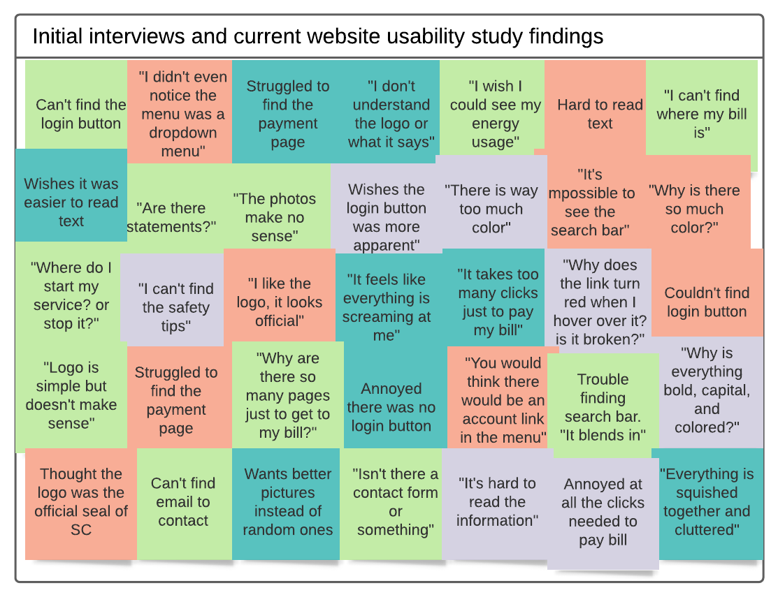
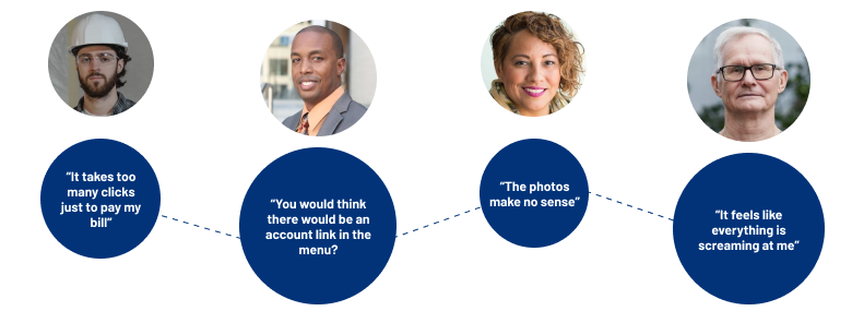
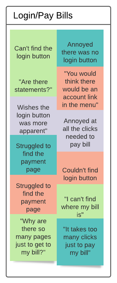
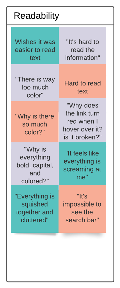
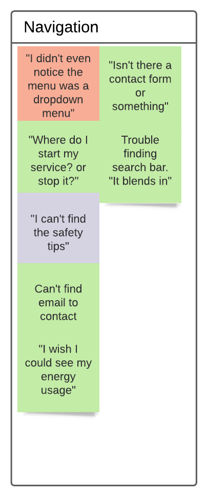
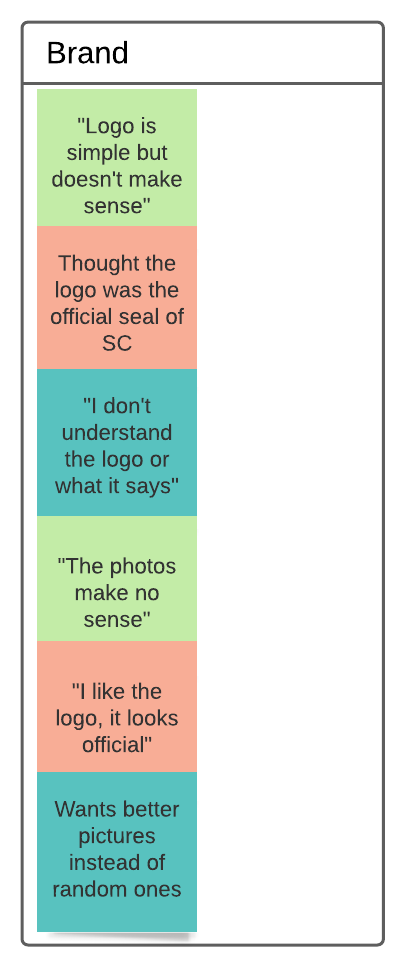
Key Findings
I received a lot of insightful information on the uses of a utility website, how users interact with the current site, and opportunities for improvement. I sorted all this information using an affinity map to find trends.
I discovered that the main use of this website is to pay your bill, which is very important for both users and the company. Unfortunately, this was one of the most apparent pain points for all users that were tested. Additionally, users struggled with navigating the website, reading content due to the overwhelming use of colored text, and didn&t understand the meaning of the photos used on the site. 4 of the 4 users were very frustrated and annoyed during the usability study of the current site.
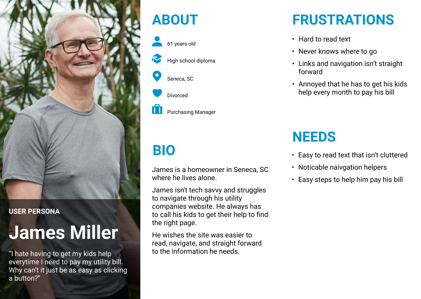
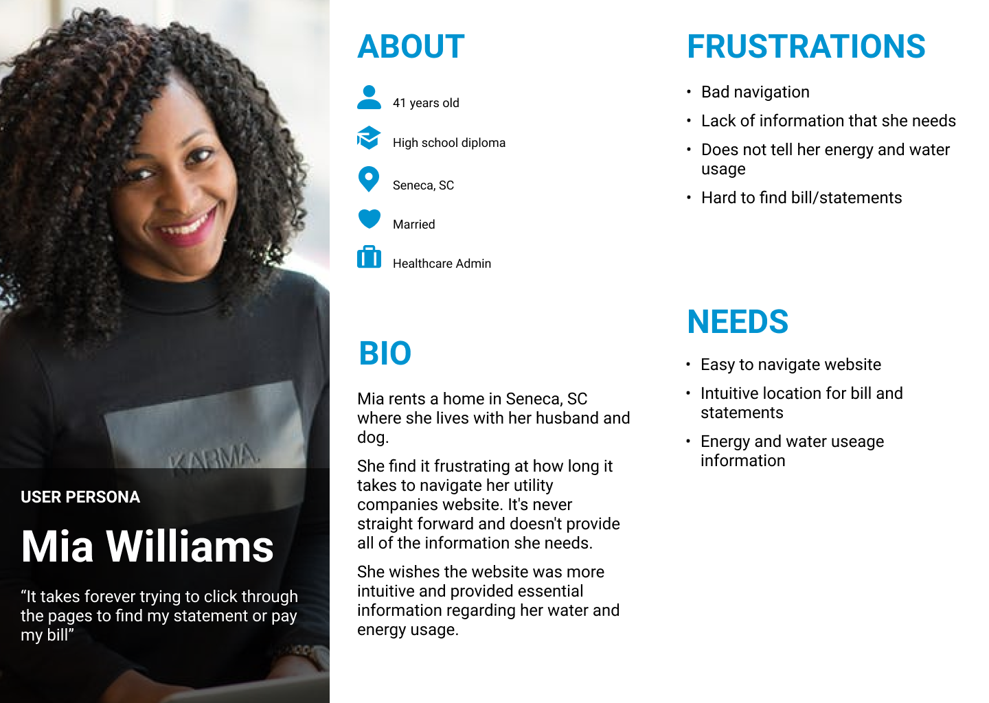
Personas
After gathering and sorting my data, I used my research information to create two user personas that will help with stakeholder buy-in and empathy throughout the entire redesign process.
IDEATION
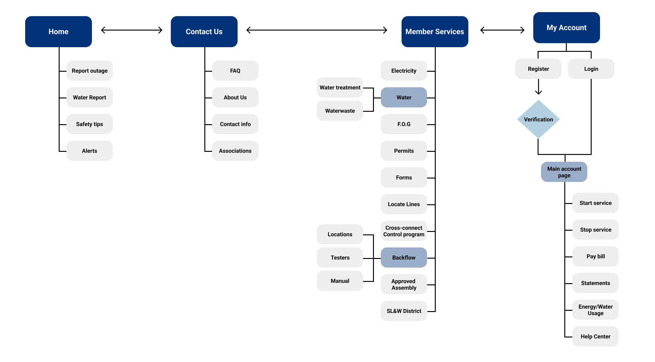
Information Architecture
Since navigation was a main user pain point, I focused on creating a clear website layout of the current content to create a more intuitive experience.
Lo-Fi Sketches
To start ideation, I reviewed my personas, research findings, and the information architecture to ensure all sketches are keeping the end user in mind. I started with a website first approach and will create the mobile screens after the final designs to ensure a responsive experience.
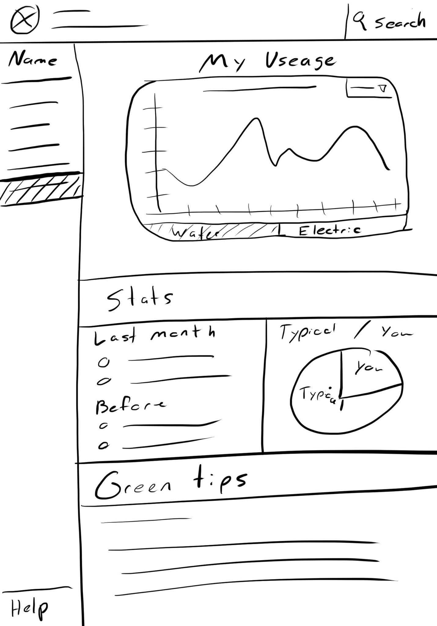
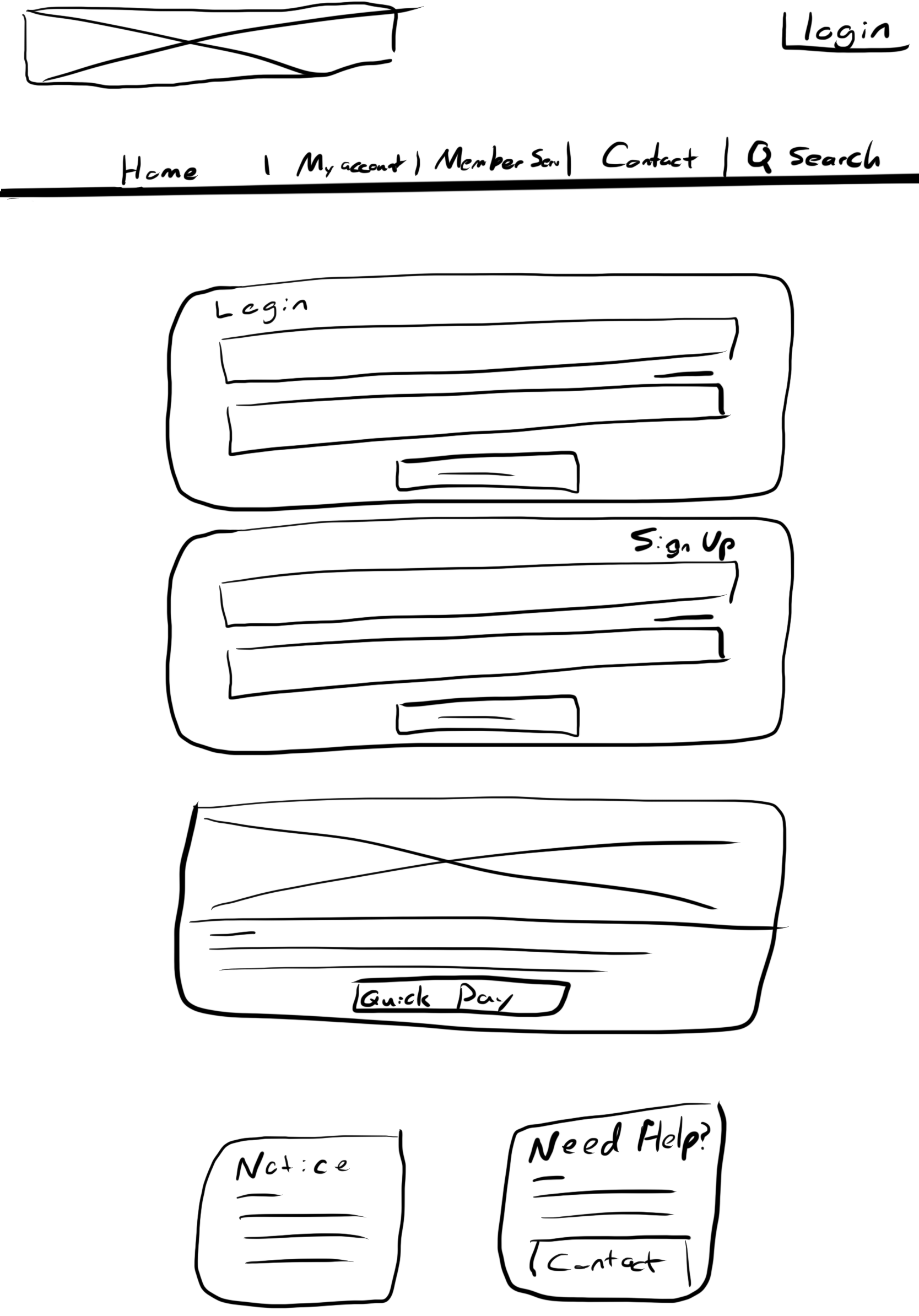
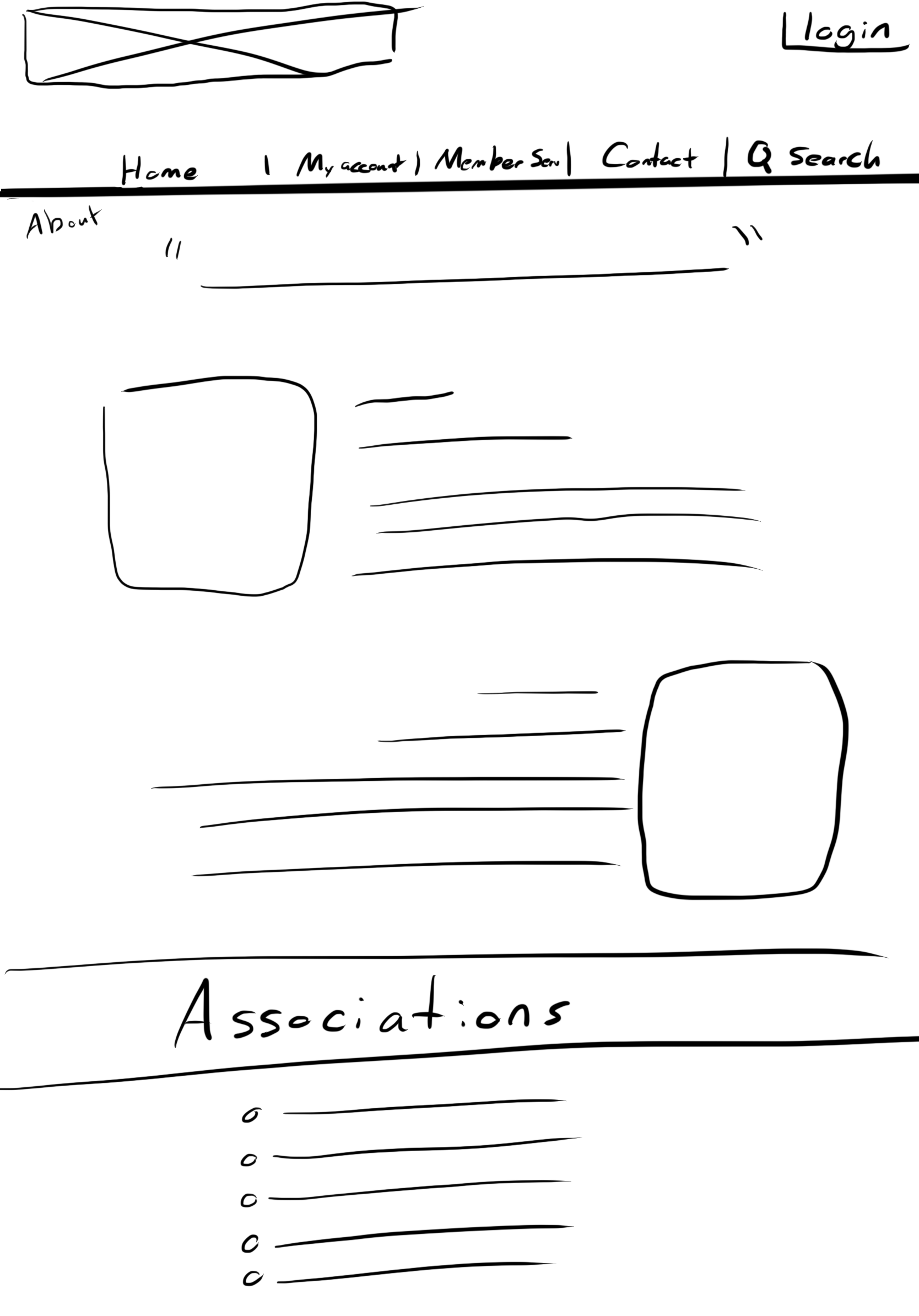
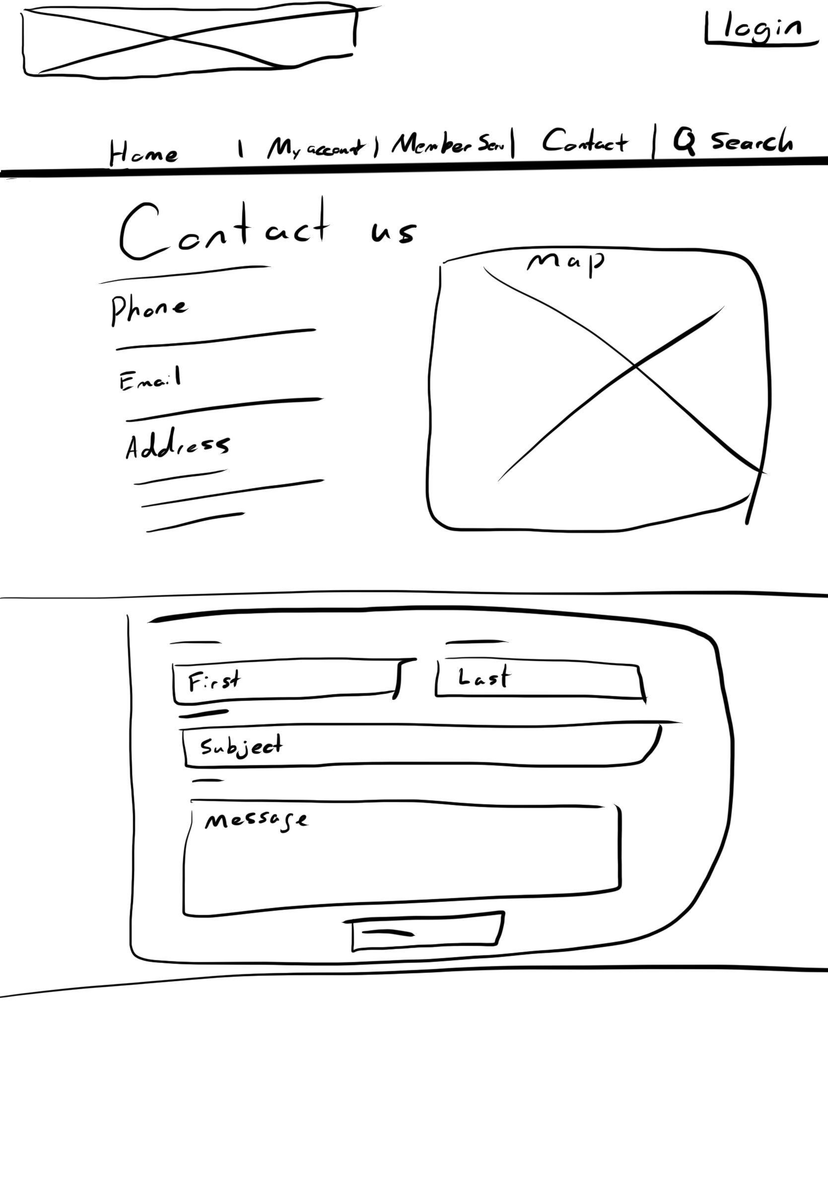
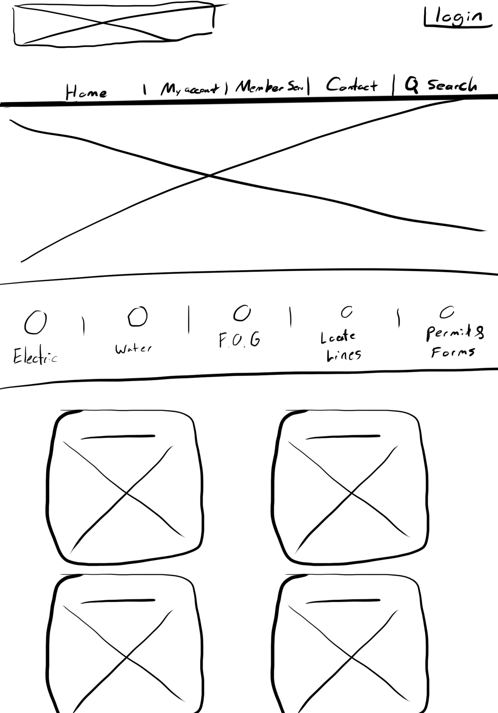
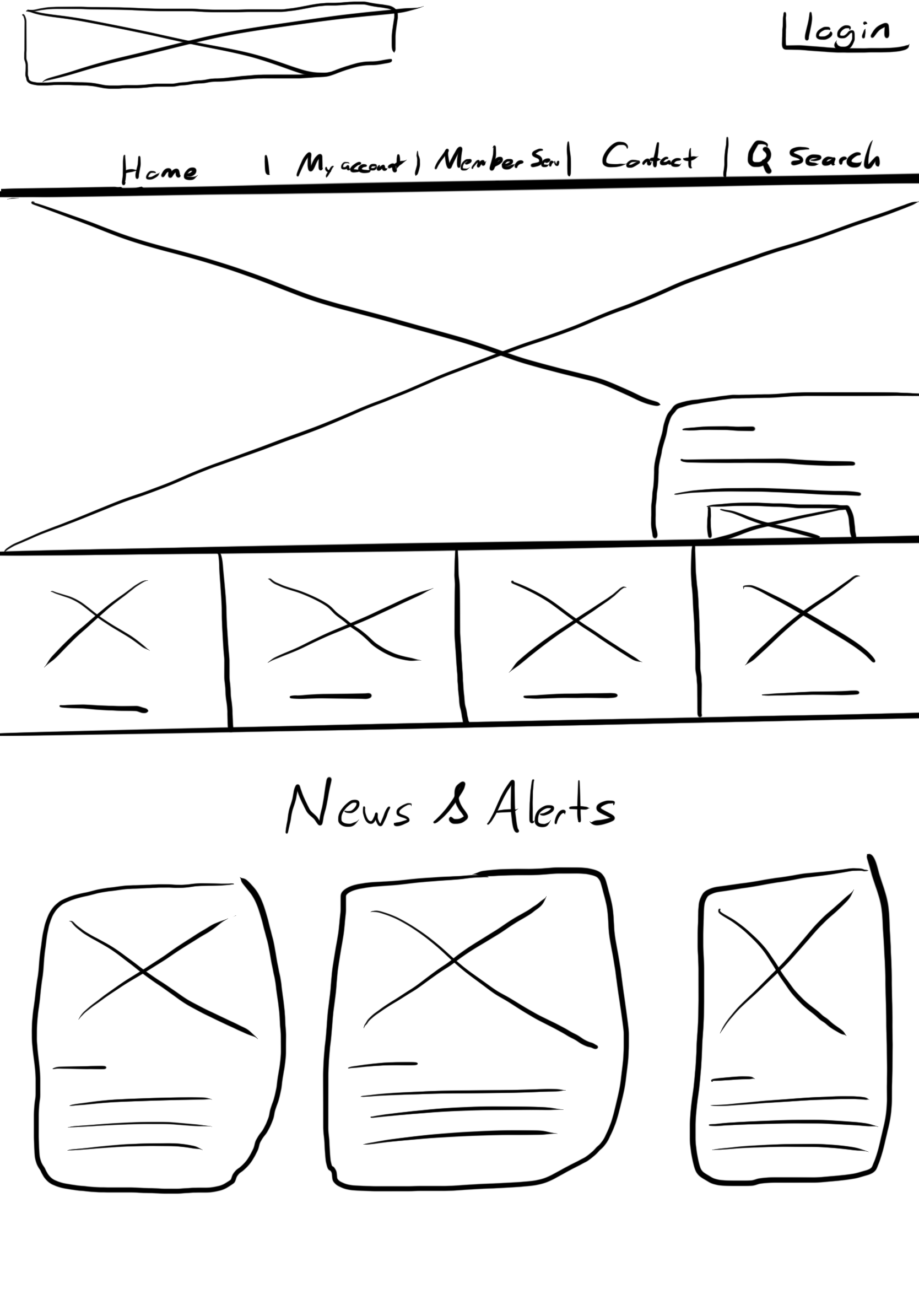
Based on my research insights, I prioritized four main objectives:
- Provide an intuitive navigation experience for users.
- Provide users with clear call-to-action buttons.
- Provide users with easy readability and scannability.
- Provide a clear brand identity.
PROTOTYPE
Hi-Fi Prototype
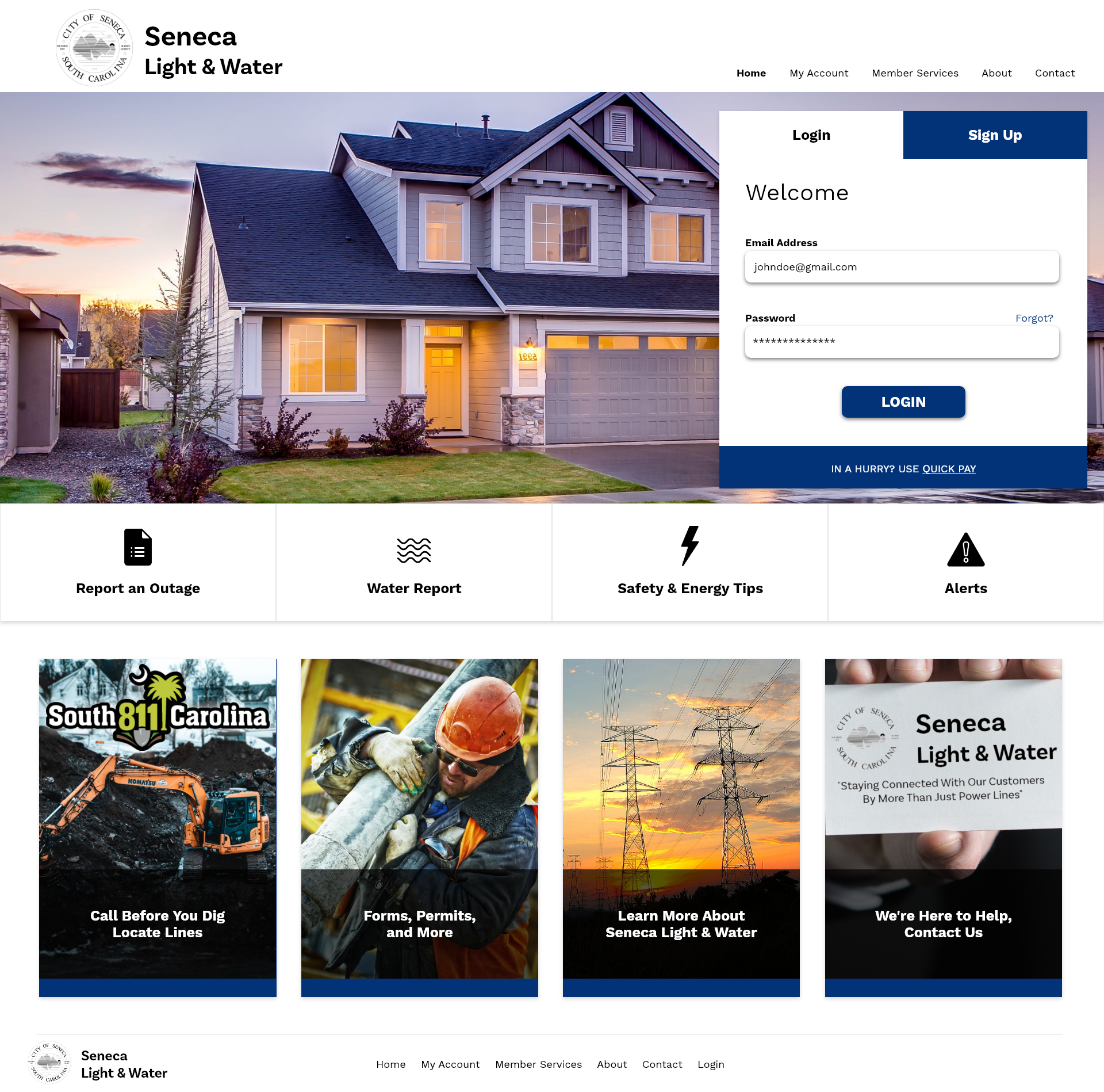
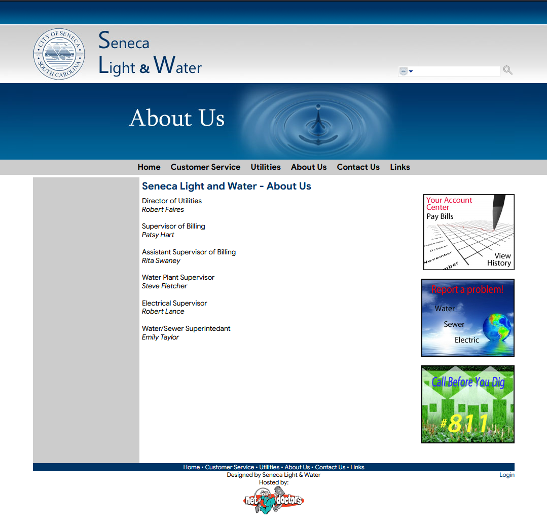
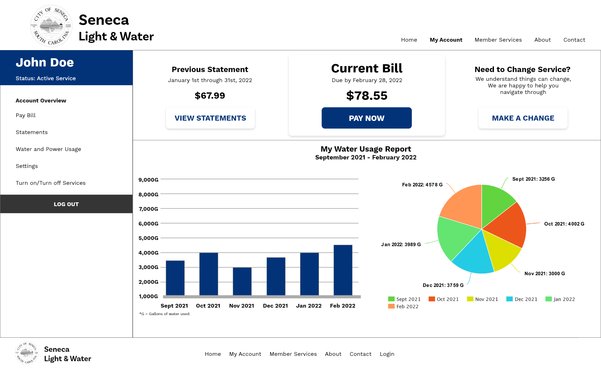
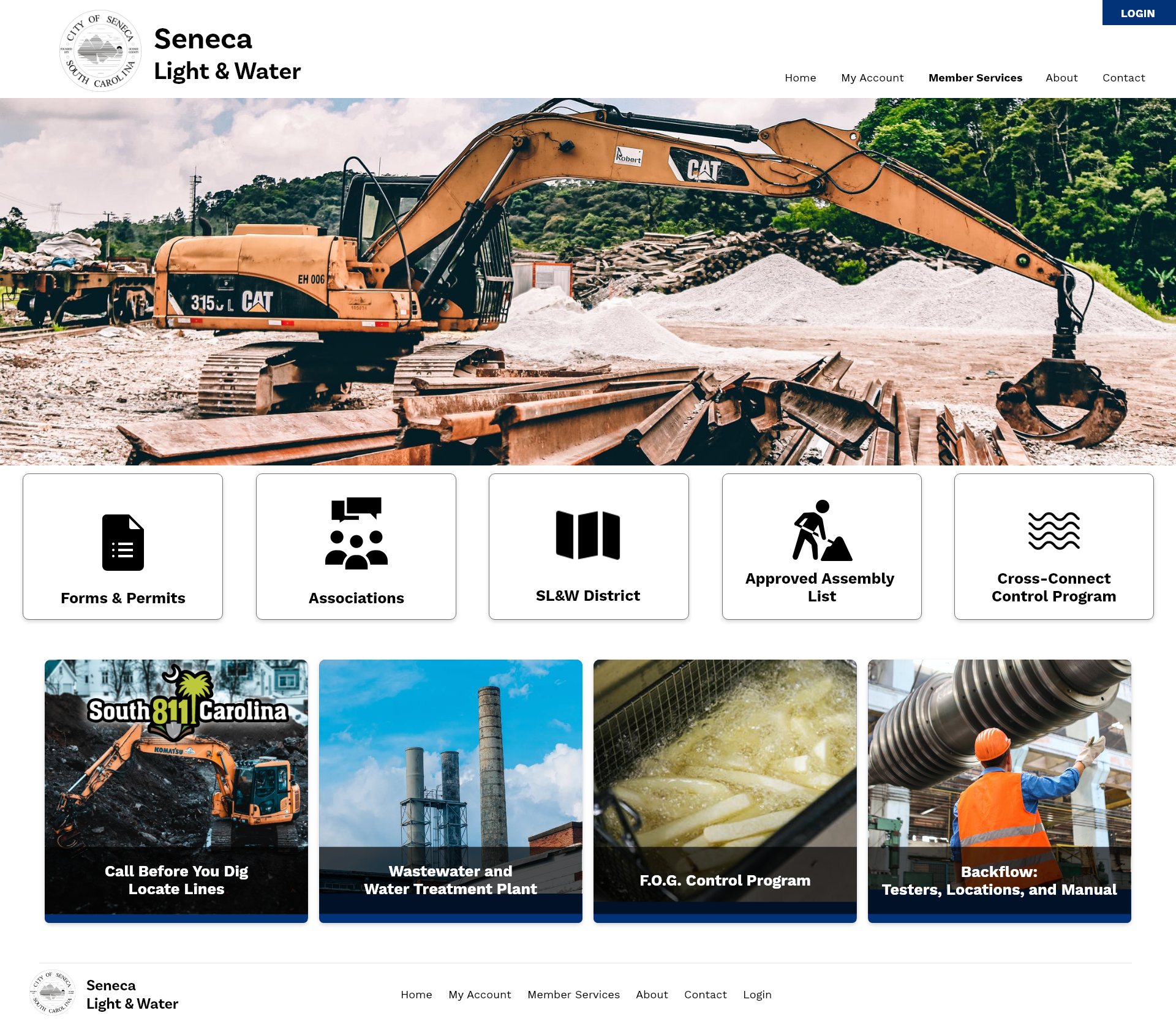
Using Adobe XD, I converted the Lo-Fi sketches into a Hi-Fi prototype. Below are the website comparisons showing the before and after changes. The current website is on the left, while the new redesign is on the right.
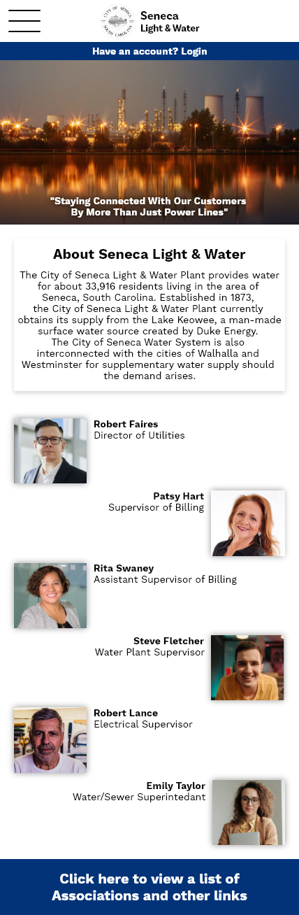
HOME PAGE
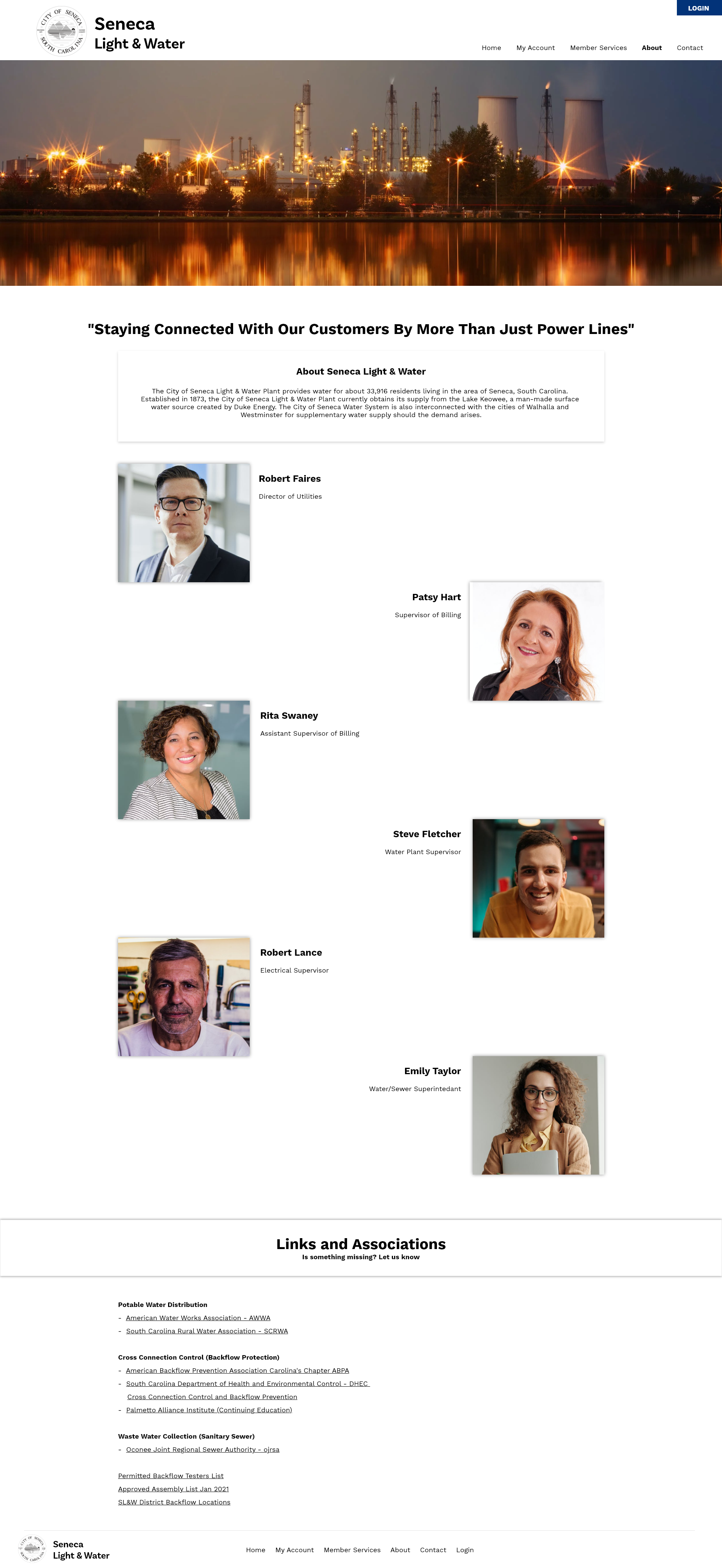
ABOUT US
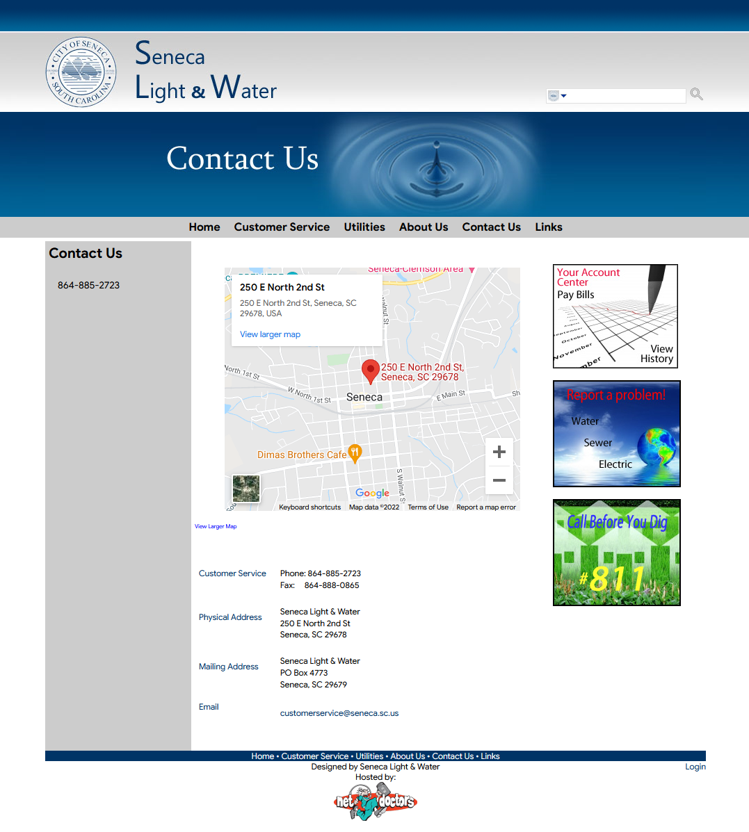
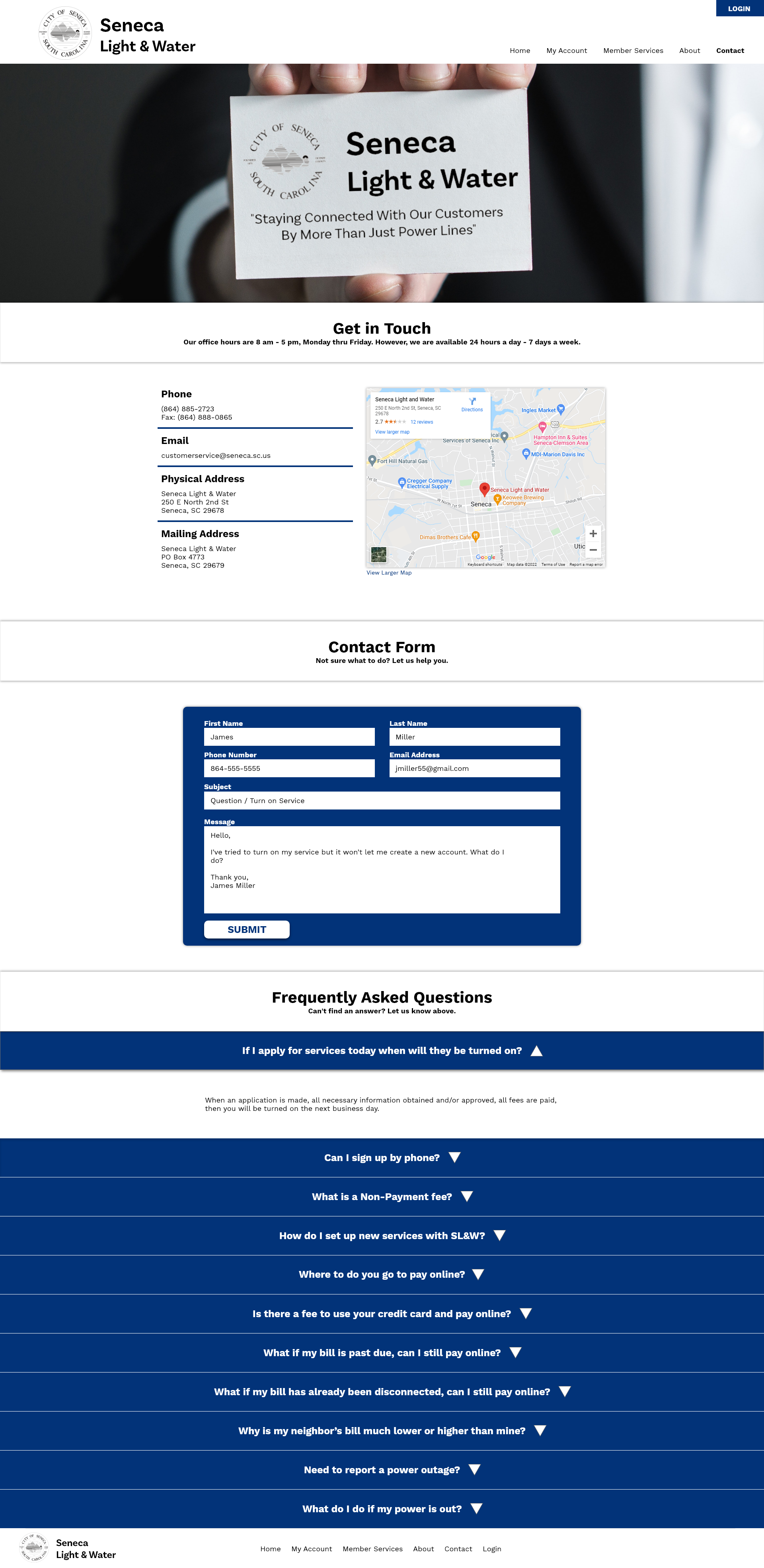
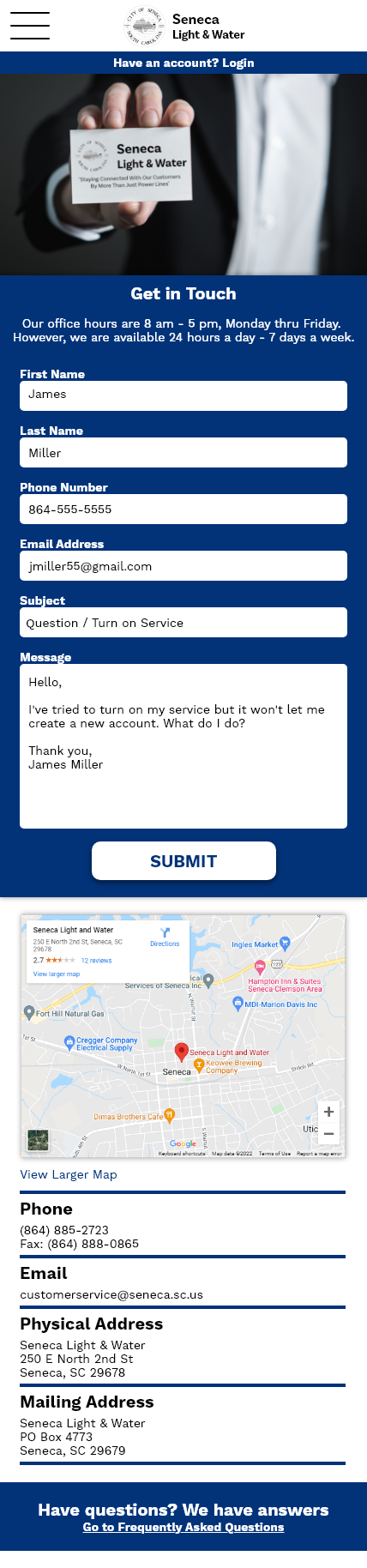
CONTACT US
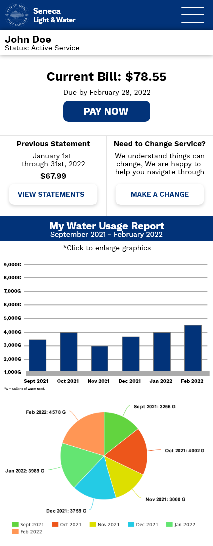
MY ACCOUNT
MEMBER SERVICES
Clickable Prototype
I created a clickable prototype of the main website pages. This was used to test and validate the designs. The usability study gave me valuable insight into what users found intuitive and what could be improved further.
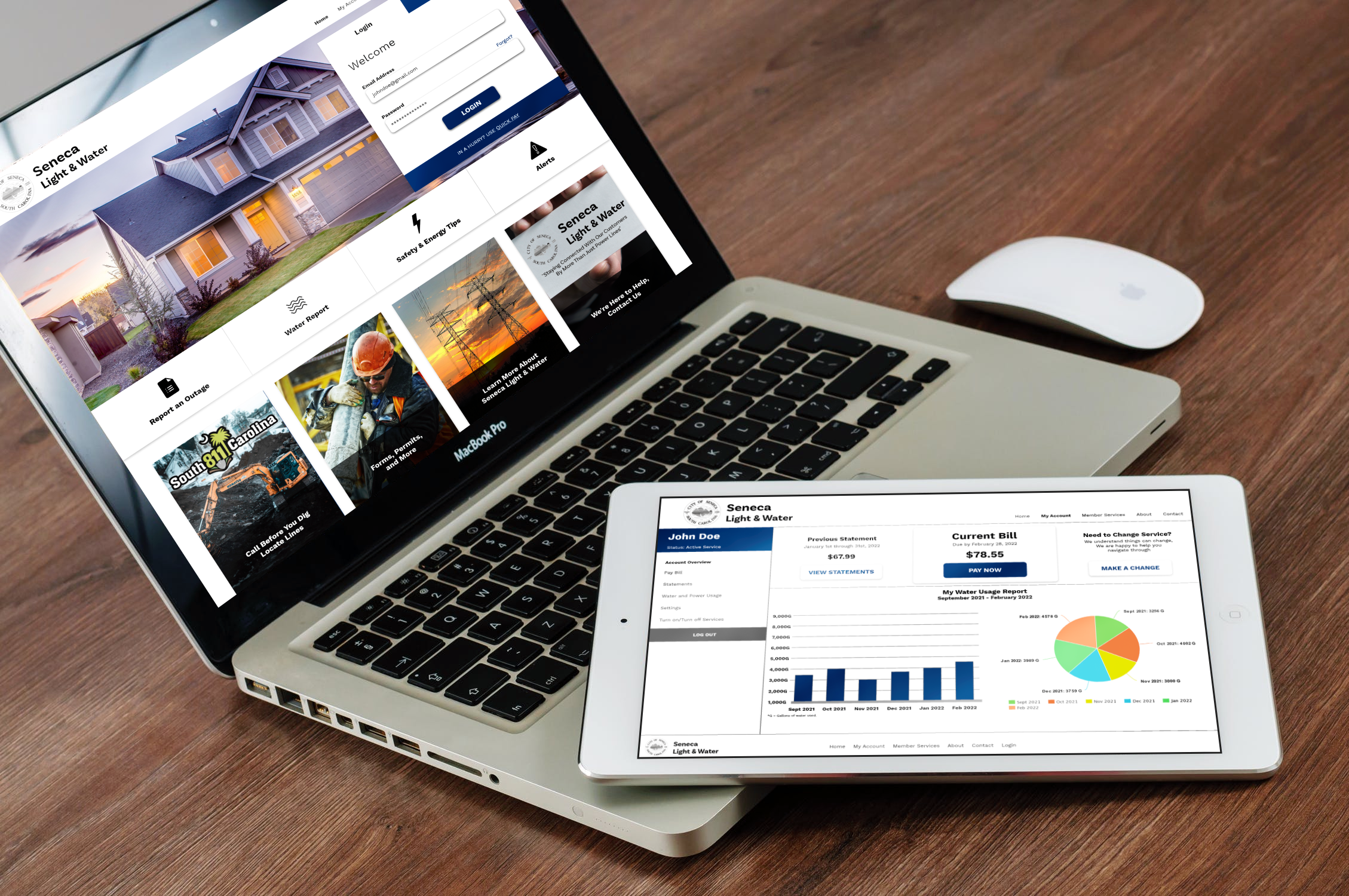
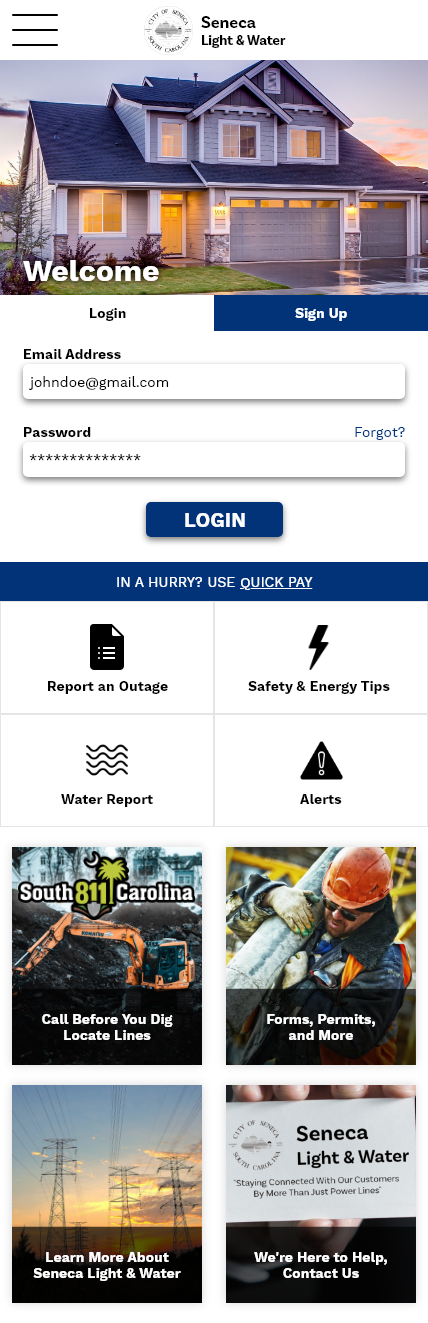
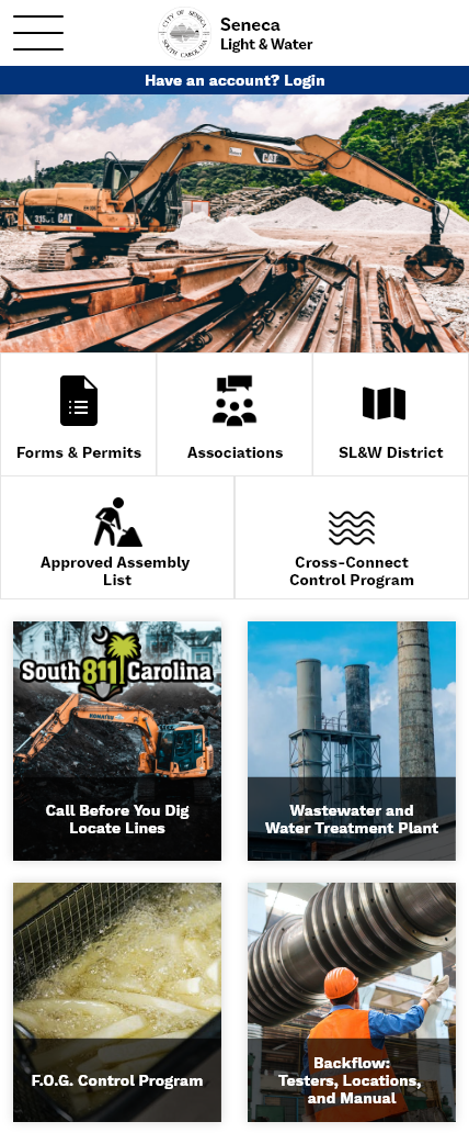
RESPONSIVE DESIGNS
To ensure the website is fully responsive, I created Hi-Fi mock-ups of the website on various screen sizes. This would allow users to access Seneca Light & Water from most devices.
VALIDATE
Conclusion
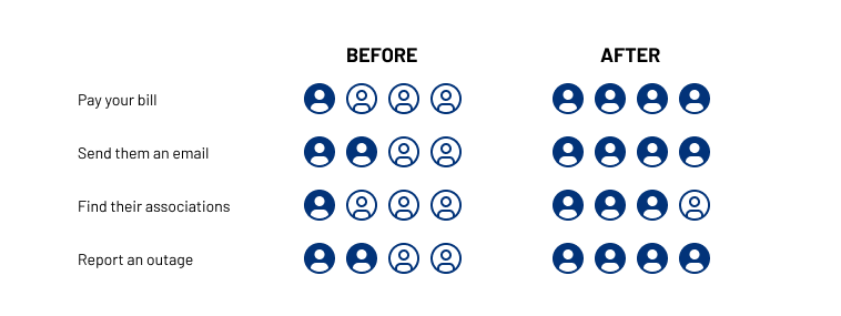
By using and analyzing all of my research and designing items, I was able to create a Hi-Fi prototype of the website and validated my designs. Using the clickable prototype with four participates, I received the following data:
Below is the results from our Hi-Fi usability study:
- (75% increase) 4 out of 4 users were able to successfully pay their bill.
- (50% increase) 4 out of 4 users were able to successfully send the company an email.
- (50% increase) 3 out of 4 users were able to find the associations list.
- (50% increase) 4 out of 4 users intuitively knew how to report an outage.
After Thoughts
This UX case study was very insightful on the realm of web design and a great learning experience. I found it quite overwhelming at first as to how I was going to fill up the space of a website with content, as it's much larger than a phone screen. By referencing back to my research and focusing on the users pain points, I was able to make a list of content they needed before I started sketching designs. I also found my sitemap to be extremely help in making sure each screen was connected in a way that made sense. In the end, I feel that I was able to effectively lay out the content and fill out the webpage in a way that flowed naturally.
This project showed me the importance of laying what the items you need to include and information architecture before starting any designs.
Note: I do not work for, nor am I affiliated with Seneca Light & Water. This UX study was done as a learning experience to explore different types of products and how to improve them.
*Icons were supplied by icons8.com.