

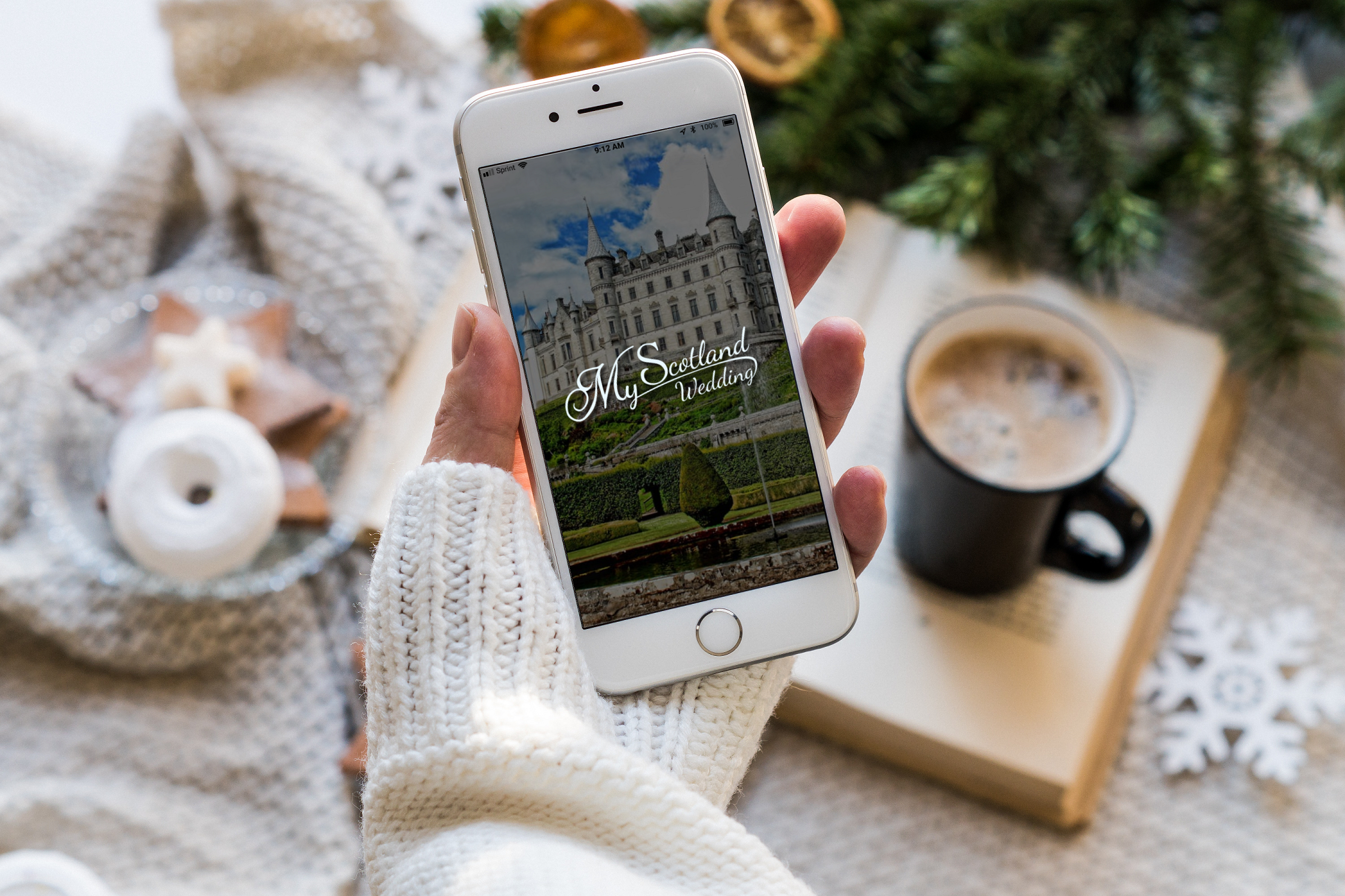
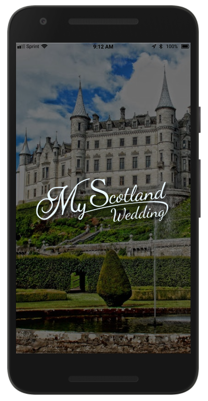
My Scotland Wedding - Mobile App
Challenge: Develop a mobile experience that helps users discover scotland wedding venues from the comfort of their homes
Deliverables: Strategy, User research report, Personas, Storyboards, User Journey Map, User Flow Chart, Sketches, UI, and Prototype.
Role: Product Designer
Goals and Objectives
Develop a mobile experience that helps users discover scotland wedding venues from the comfort of their homes
Challenges
- Time - Users lack the time commitment it takes to visit multiple wedding venues, and for those out of the country, it adds additional time needed to fly over.
- Budget - Users have difficulty knowing what venues fit into their budgets upfront. Many venues lack up-front pricing until after interest in booking has been made.
- Accessibility and Diversity - Many venues lack the necessary information regarding accessibility or diversity that users need to make an informed decision.
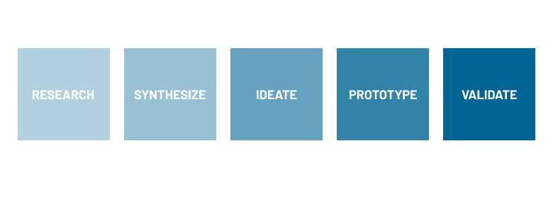
Process
I started the UX design process with preliminary user research to understand the current market and opportunities. I then turned to user research to understand pain points the users face, analyzed the findings and defined the main tasks the product should accomplish. I developed the concept into UI sketches and tested it with possible users. Using Figma, it was then converted into hi-fi prototypes.
RESEARCH
Preliminary Research
Since I was unaware of the wedding venue marketing, I conducted a competitive analysis of direct and in-direct competitors to understand key demographics, gaps in the market, and opportunities.

DIRECT COMPETITOR
STRENGTHS
Lots of venue options
Guides for getting married
Honeymoon ideas
Trustworthy brand
Check availability feature
Accessibility information
WEAKNESSES
Lots of clicks needed
Pricing is not clear
No catering options
Hard to find venue details
Difficult to find photos
Not an intuitive design

DIRECT COMPETITOR
STRENGTHS
Legal information
Personal vibe
Organized design
Sample pricing available
Clear branding
Menu is easy to navigate
WEAKNESSES
Font is hard to read
Not mobile friendly
No photos of actual venue
No layout/sqft information
No catering menu
No search feature

INDIRECT COMPETITOR
STRENGTHS
Helps you keep track
Inclusive design
Photos of layout
360 tour of venues
Venue capacity information
Search by accommodations
WEAKNESSES
Not a responsive design
Not mobile friendly
Pricing is not upfront
Not an intuitive design

INDIRECT COMPETITOR
STRENGTHS
Track venues
Make a guest list
Wedding website builder
Fully responsive
Check availability feature
Reviews and photos from users
WEAKNESSES
Pricing is not upfront
Lacking accessibility information
Hard to find information
Navigation is very complicated
Inconsistent brand
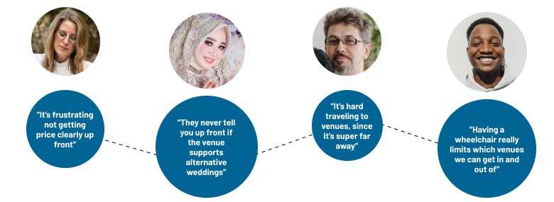
User Research and Key Findings
To understand the key demographics within the Scotland Wedding business, I conducted a preliminary survey of those who are planning a Scotland wedding or will be in the near future. After the key demographics were determined, selected a few individuals for interviews to better understand the problem and uncover user pain points.
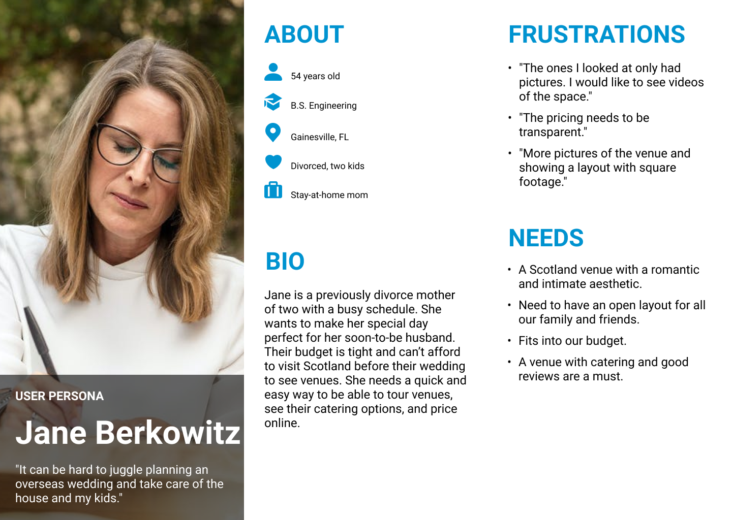
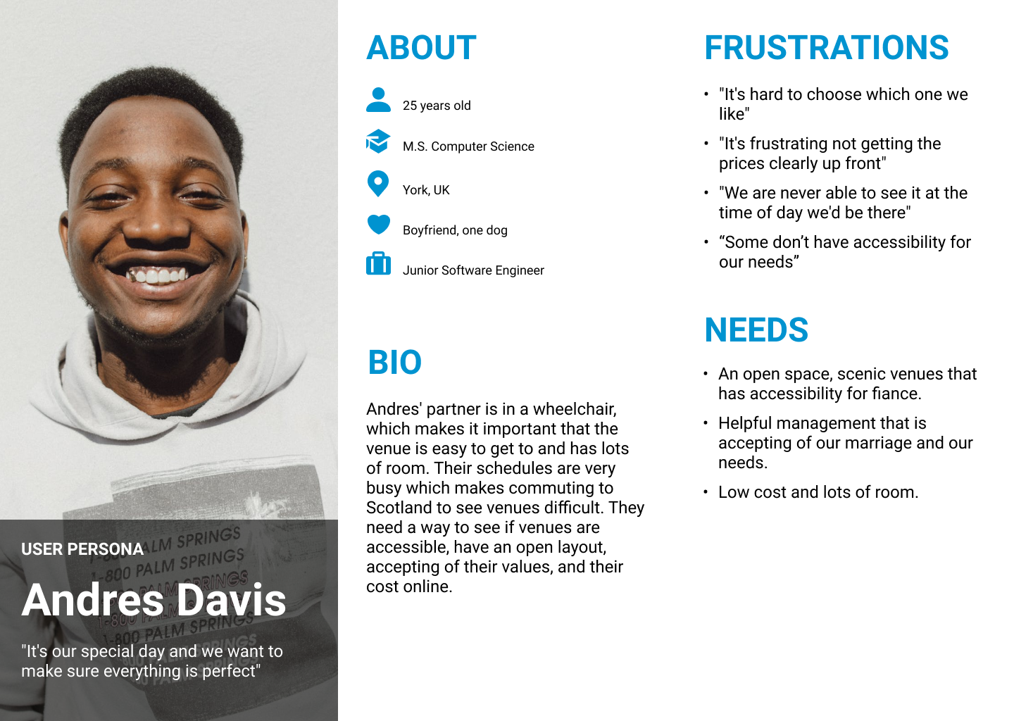
Personas
After analyzing the data, I created two persona to assist with communicating information gathered about the prospective end user throughout the design process.
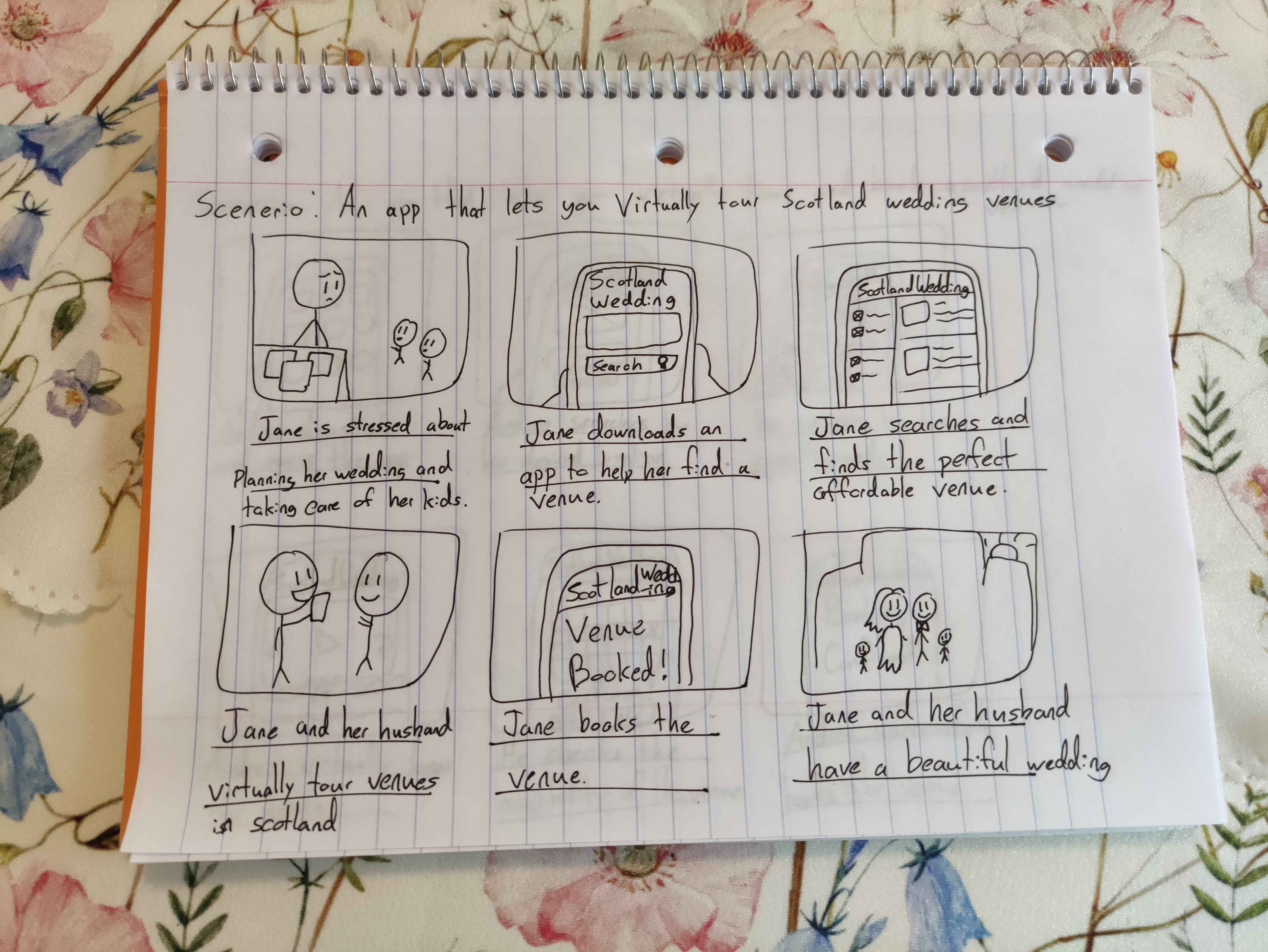
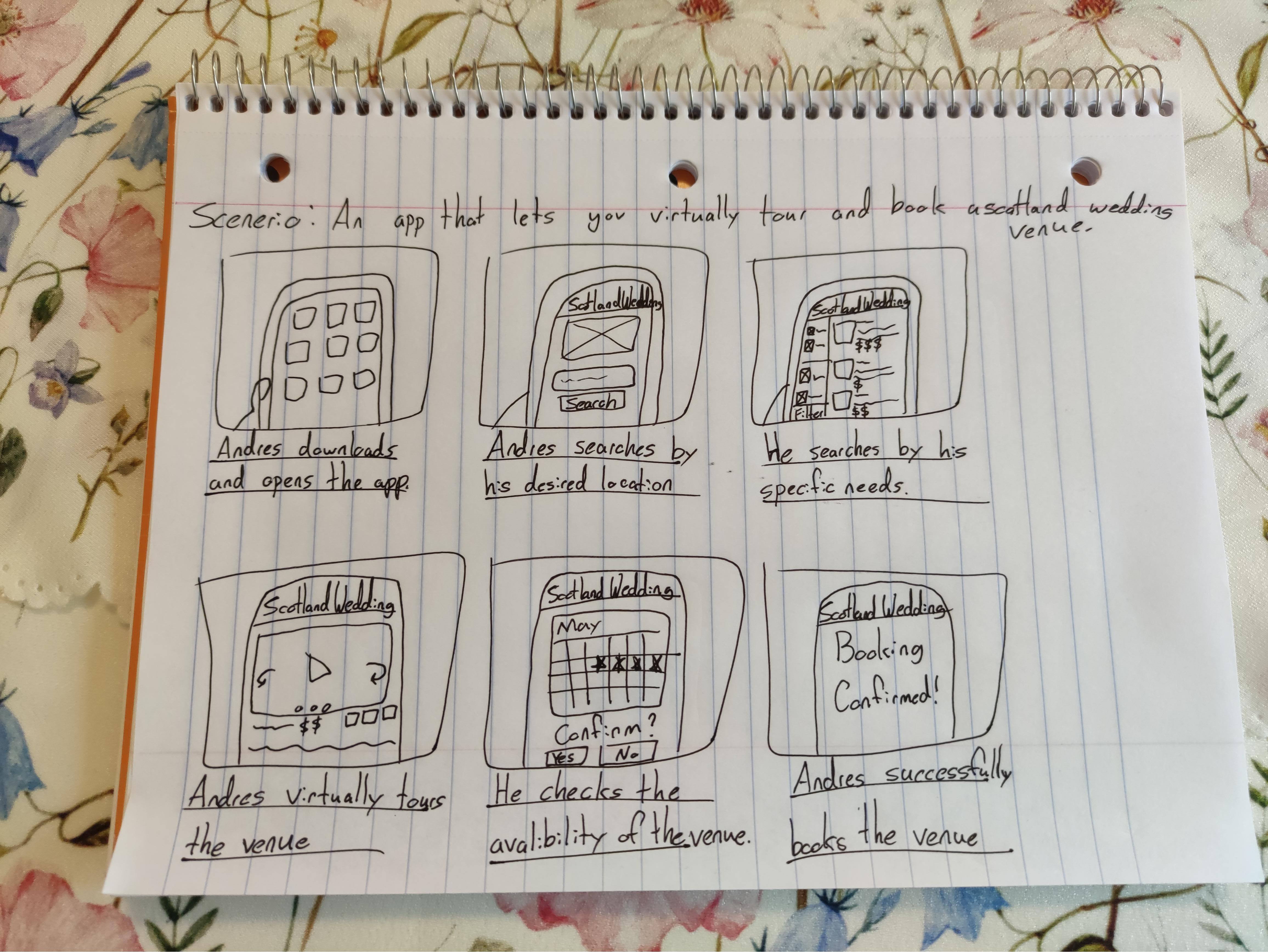
Storyboards
To further stakeholder buy-in, I created two storyboards regarding the effects the new app will have on the end user.
IDEATION
Concept and Strategy
Using the user journey map, I was able to narrow down the main flow of the app along with potential missing opportunities. This helped create a clear navigation and user flow that will be intuitive for the user.
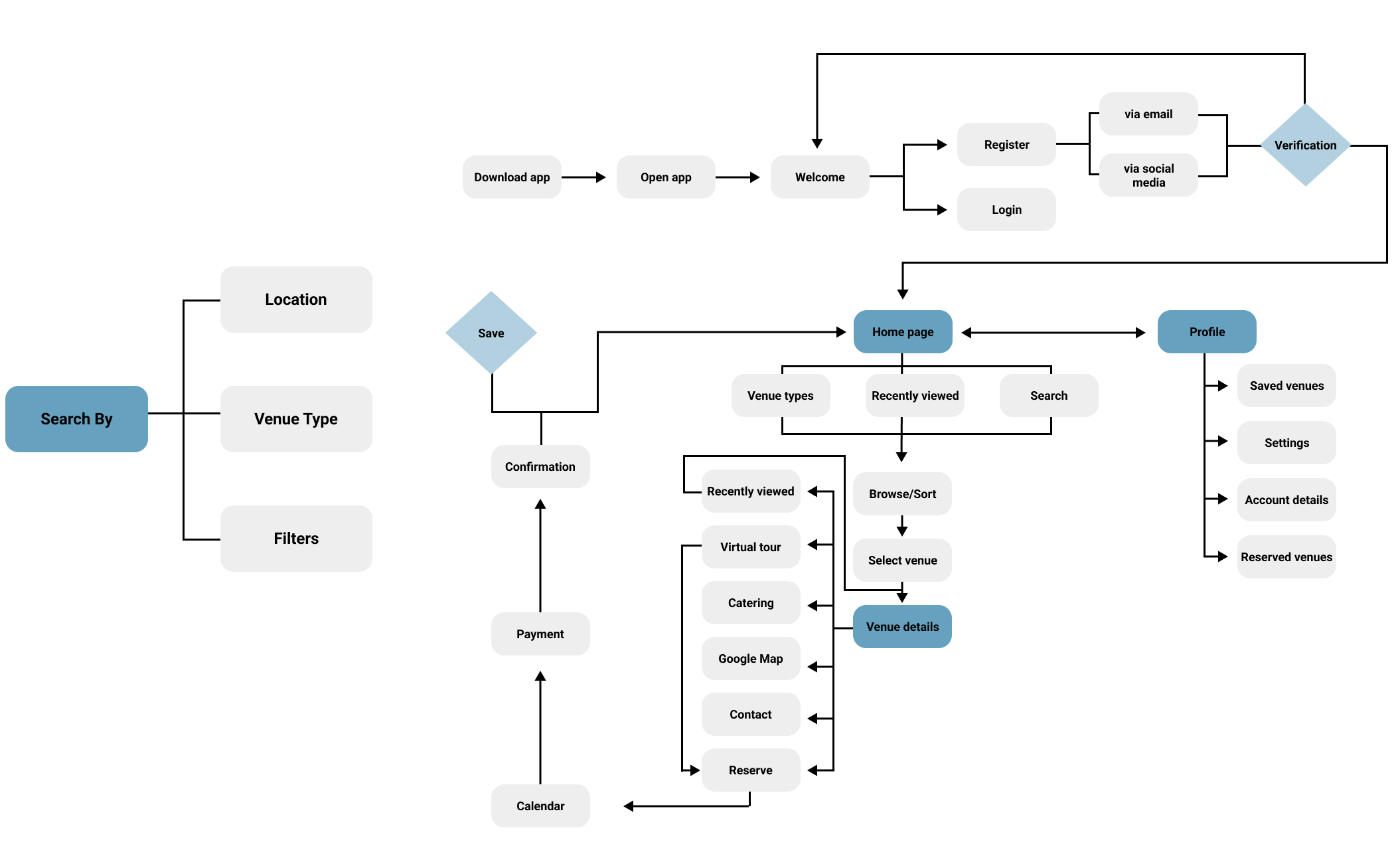
User Journey Map and User Flow Chart
To communicate the concept, I generated a user flow chart.
ACTION
1. Download app and search
TASK LIST
- Download app
- Input search location
- Set desired distance from location
FEELINGS
- Excited to get started
- Impatient
IMPROVEMENT OPPORTUNITIES
- Suggest other locations based on search
- Show top venues
ACTION
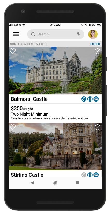
2. Filter results
TASK LIST
- Filter by price, sqft, accessibility needs, ect
- Scroll through/view list of venues
- Click on each possible venues
FEELINGS
- Intimidated by all the options
- Frustrated by multiple clicks
IMPROVEMENT OPPORTUNITIES
- Flippable photos, videos and specifications
- Price front and center
ACTION
3. Narrow down choice
TASK LIST
- Open multiple pages for venues of interest
- Review each specification
- Review videos, layout, space, accessibility
FEELINGS
- Happy by all the possibilities
- Stress about making a choice
IMPROVEMENT OPPORTUNITIES
- Save venues of interest
- Compare venue features
- Easy checklist to see what the venue has and doesn't
ACTION
4. Contact venue for availability
TASK LIST
- Select venue
- Find contact information
- Contact venie about date wait for response
FEELINGS
- Impatient about response
- Anxious about availability
IMPROVEMENT OPPORTUNITIES
- Easy to find contact information
- Chatbot that can check dates and answered FAQs
- Reserve your own dates
ACTION
5. Book venue
TASK LIST
- Reserve dates/check out
- Enter details
- Wait for confirmation and next steps
FEELINGS
- Excited to be finished
- Nervous something will go wrong
IMPROVEMENT OPPORTUNITIES
- Costs front and center
- Down payment expected
- Instant confirmation and next steps for ease of mind
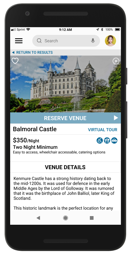
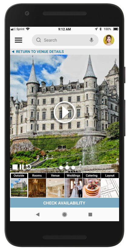
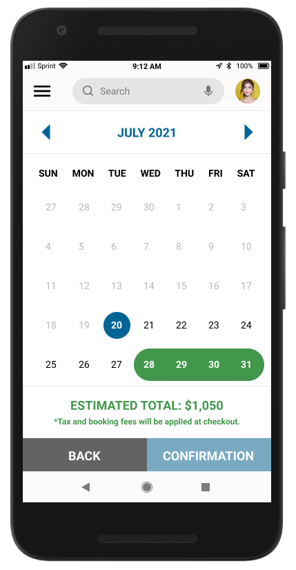
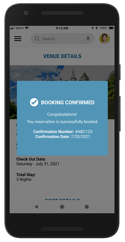
Lo-Fi Sketches
I sketched many options for each screen, constantly referencing the target audience, user pain points, and design objectives to create an intuitive experience that will allow users to virtually tour and reserve Scotland wedding venues from the comfort of their homes.
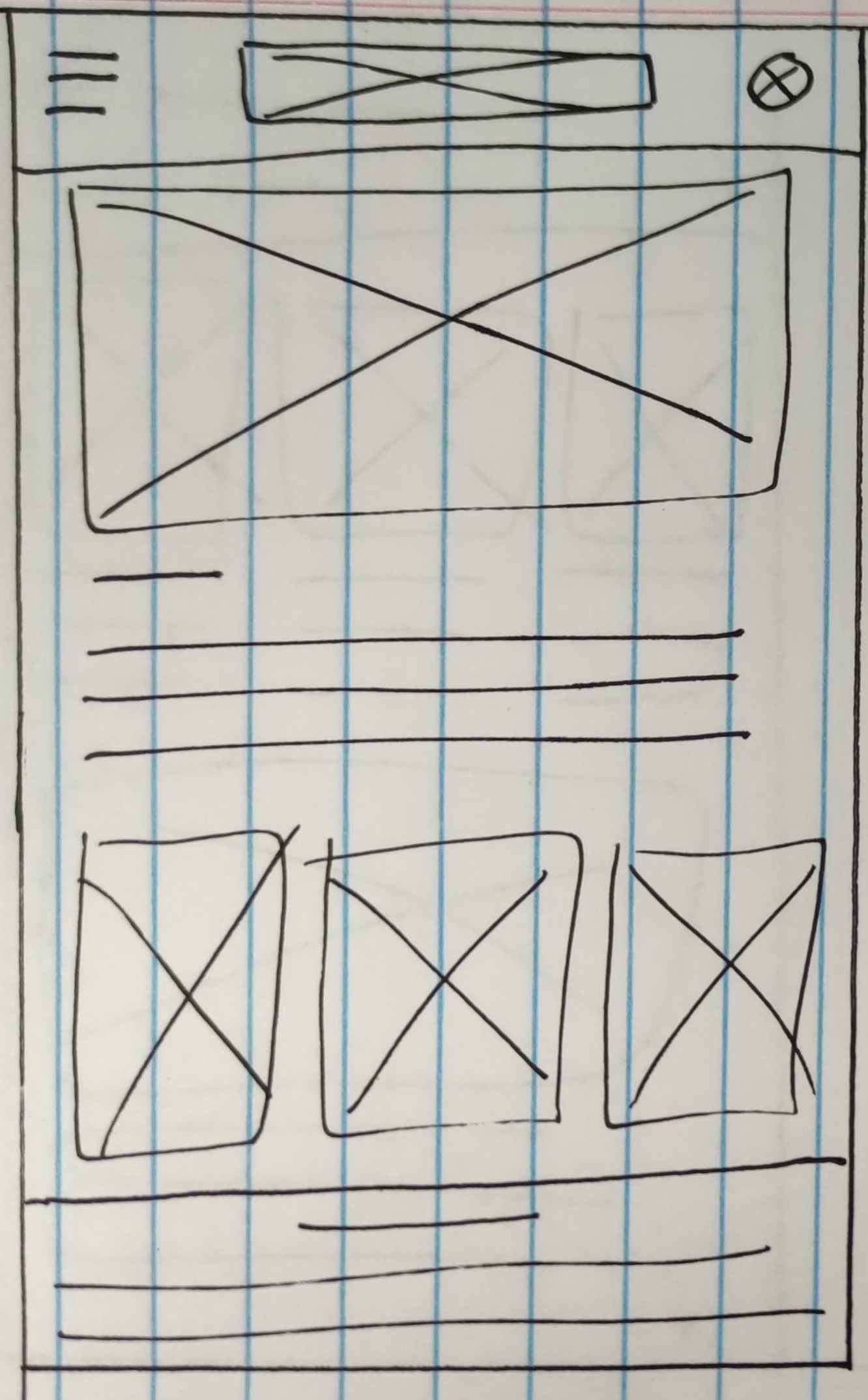
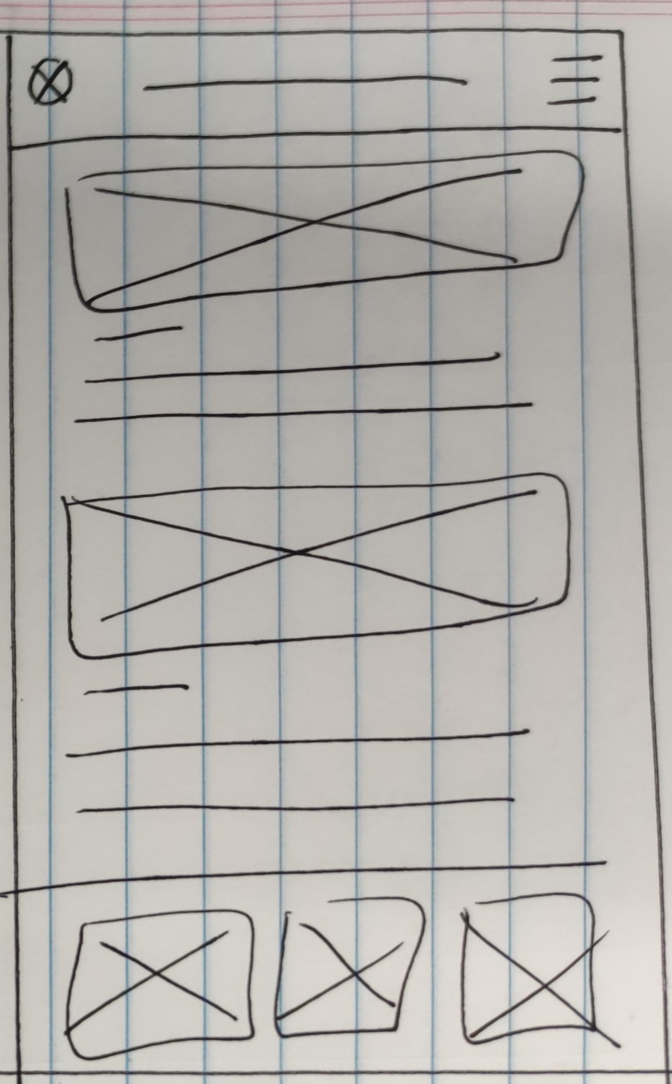
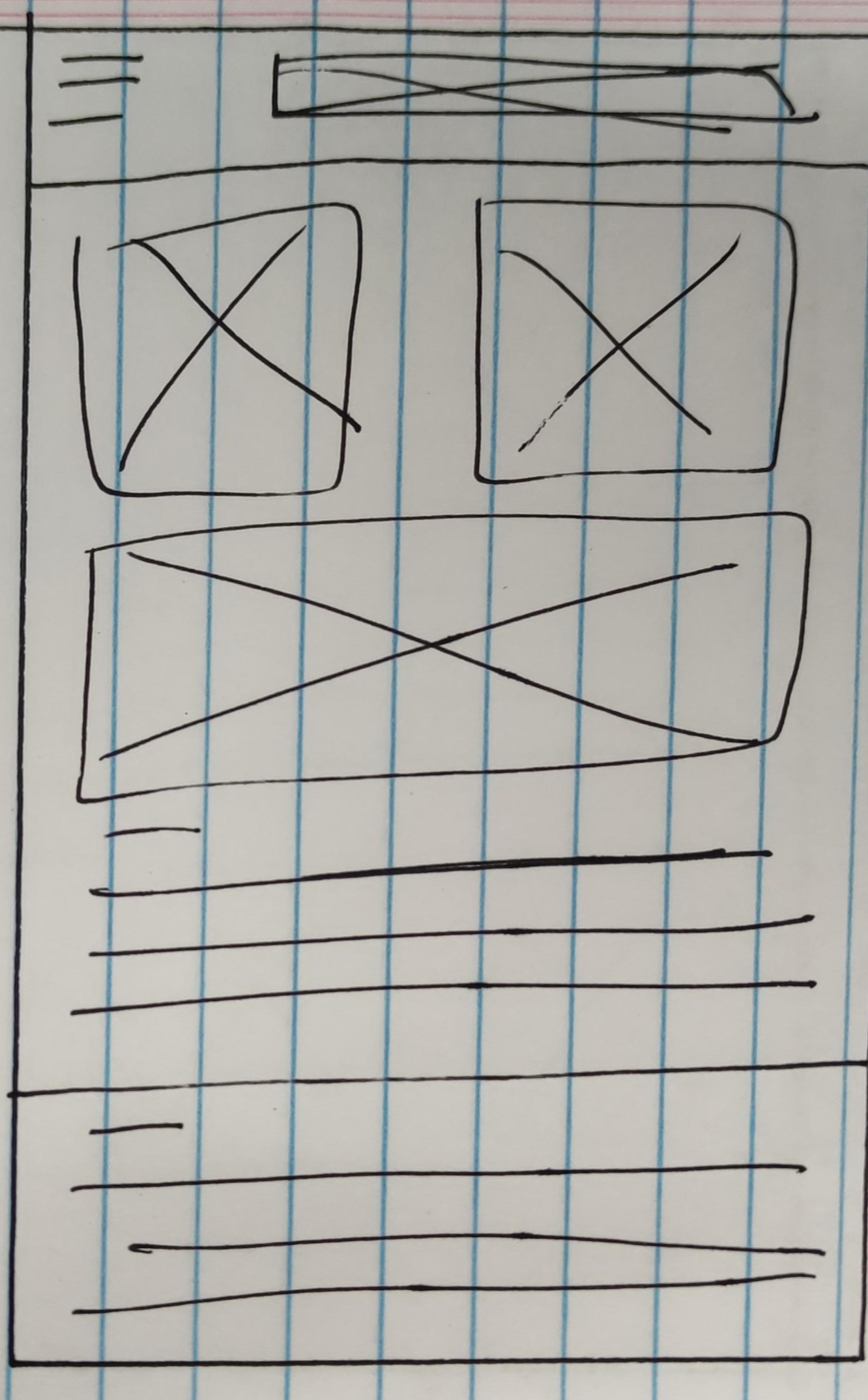
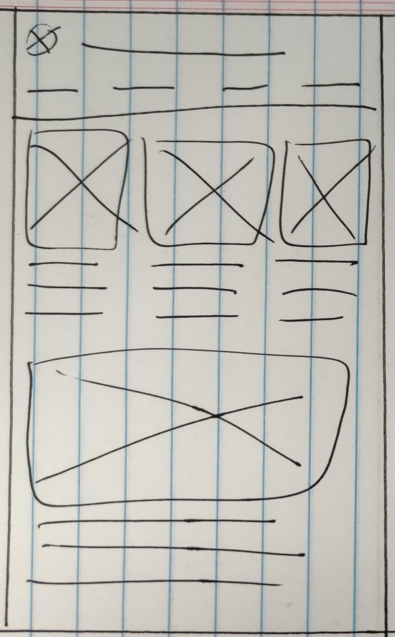
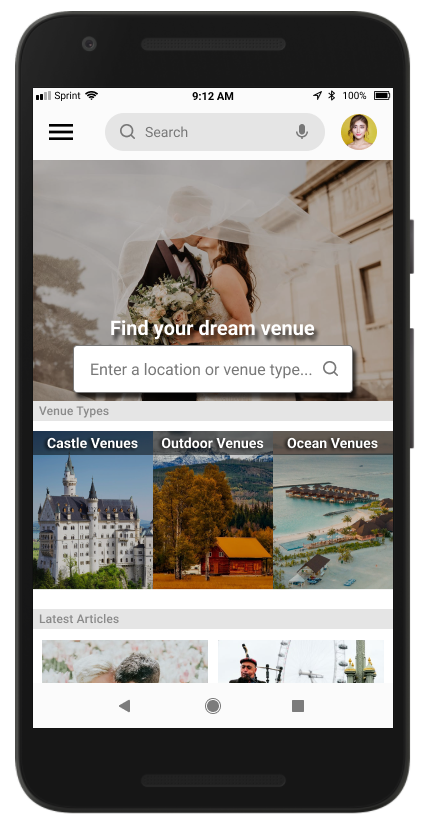
Based on my research insights, I prioritized three main objectives:
- Provide a platform where users can easily narrow down and search for desired venues;
- Provide a platform with up-front information for each venue with the option to tour it virtually;
- Provide a platform where users can easily reserve the venue straight from the app.
PROTOTYPE
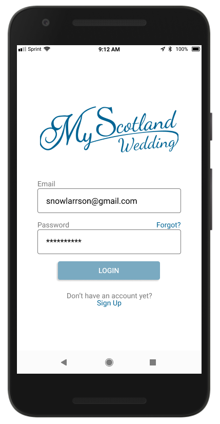
Hi-Fi Prototype
During this stage, I iterated on my design based on the Lo-Fi usability study findings. I discovered that there was confusion around reserving the venue and checking out, misunderstandings of what the blog post section was, and how to access the user profile. Therefore, I focused on improving the above while finalizing the UI design.
Clickable Prototype
The clickable prototype was created to test and validate the design. It was very useful in understanding how real users navigate the app and I gained realistic insights on what worked well and what required further improvement. The prototype only includes the aspects that I planned to get users on.
VALIDATE
Conclusion
After reaching back out to our original research participants to share the final designs, I received many compliments on the innovation of this app. Many users shared that they felt many of their pain points were successfully addressed and that they would love to use the app to plan their wedding.
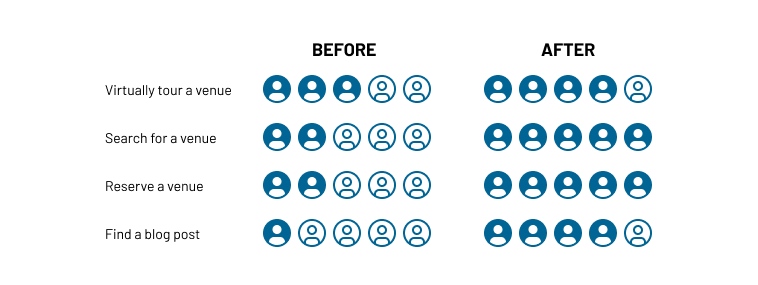
Below is the results from our Hi-Fi usability study:
- (20% increase) 4 out of 5 users were able to virtually tour a venue
- (60% increase) 5 out of 5 users were able to successfully search for a venue.
- (60% increase) 5 out of 5 users were able to successfully reserve a venue.
- (60% increase) 4 out of 5 users intuitively knew what the blog section was, with the name change.
After Thoughts
This UX case study was very insightful for my first project. At the beginning of this project, I found it difficult on how I was going to fit all the needed content in a way that wouldn’t be overwhelming while also being intuitive. However, I feel that starting with Lo-Fi sketches gave me the room to try different placements before investing time into creating a Hi-Fi product. Additionally, I gained valuable feedback from my usability studies that really helped ensure a great user experience.
Note: This UX study was done as a learning experience. My Scotland Wedding is not an actual company.